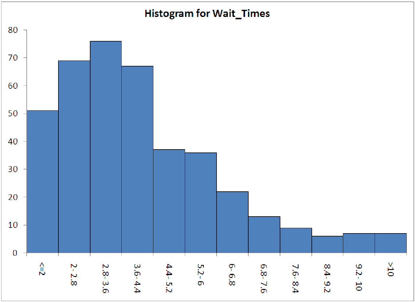
Figure 15.2: Histogram of wait times at Beef n’ Buns, showing the right-skewed distribution.
Part 1. Open the data file C15 WaitTimes.xls [.rda]. This first worksheet (labeled ”part 1”) contains a list of 400 service times at Beef ’n Buns. Generate a histogram of the data to match the histogram below. Notice that the distribution of service times is significantly right-skewed.
One of the assumptions about linear regression involves the distribution of the data. If were to try and create a regression model to predict service times, we would find this model to have significant error, due the data’s skewness. There is, however, an easy way to normalize the data in order to produce a better model. Create a column of wait times that has been transformed by taking the natural logarithm. Create a histogram of these logged wait times. What do you see? Under what circumstances might this be a useful tool for model building?
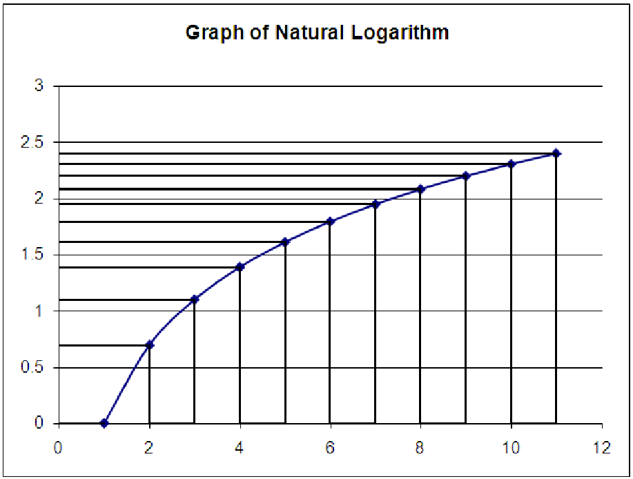
Part 2. The second worksheet in the file illustrates another property of logarithms. In fact, it is this property that makes the process in part 1 work. This sheet shows a graph of the natural logarithm, along with vertical and horizontal lines passing through the data points. From looking at the graph, which has points that are equally spaced in the x direction, can you explain why logarithmic functions are sometimes described as ”compressing data”? Your task is to first change the x coordinates of the points (in column B) so that the change in y between successive points is the same - exactly the same. Then, use the other information in the data table and what you know about the property of logarithms to explain why this particular spacing of x values solves the problem. What other x values would work?