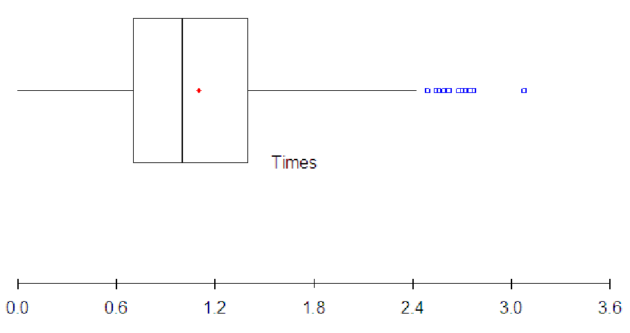
Figure 6.1: Boxplot of service times at Beef n’ Buns.
Open any newspaper or magazine and you will come across graphs and representations of data that are supposed to help you make sense of some issue or help you decide whether to vote in favor of some proposition or not. You will eventually find yourself sitting in a meeting listening to a presentation with graphs and charts in it. You will probably have employees sending you reports with graphical representations of data designed to help you make a decision. However, it is relatively easy to manipulate your perceptions by presenting a particular graph. By choosing how to present the information, the writer can control the way you perceive the issue. This is true even when the writer is supposedly objective.
With a little work, though, you can look at a graph and mentally convert it to another type of graph. This will provide you with the flexibility of seeing data from multiple perspectives, gaining a much deeper insight into the way the data is structured. This, in turn, will help you make more informed decisions and will help you recognize when someone is trying to manipulate the presentation of the data toward a certain end. For this section, though, we will concentrate on the connections between boxplots and histograms, and we will develop ways to picture one graph when presented with the other type of graph.
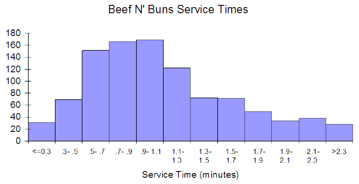
Another key benefit to having this flexibility is that you can use a boxplot to help decide how to set up a histogram. Often, it is difficult to set up a useful histogram on the first try. Look back at the histogram of Beef N’ Buns service times in Exploration 6A. If the student had first created the boxplot shown below, she might have had a better starting point for making the histogram.
Based on this, she might have set a minimum value of about 0.3 (about halfway between 0 and the first quartile). Then, using 10 bins for the histogram to cover the range from 0.3 to 2.4 would make the bin widths (2.4 - 0.3)/10 = 2.1/10 = 0.21 which is about 0.2 (round off to make nice bins in the graph). She could then add two bins (for the ”<= 0.3” and the open bin on the right side) making the histogram shown below. This graph clearly shows that the data is positively skewed, indicating that the bulk of the service times are below the mean service time (about 1.1 minutes, based on the boxplot).
This section will involve a lot of estimation and inferencing. Estimation involves making a rough guess at some quantity based on either scale or units. Inferencing involves drawing conclusions based on limited information. In order to inference, you will have to interpret the information you are given and ”fill in the missing pieces” since you will not have complete information. As part of this process, notice that in the Beef N’ Buns service times, reporting the ”average service time” as 1.102 minutes (this is the mean) with a standard deviation of 0.542 minutes would misrepresent the situation. Since the data is positively skewed, we can see that most of the data falls to the left (below) the mean service time. In fact, the three largest bins of the histogram are to the left of the mean. This tells us that the mean may not be the best choice for representing the average service time. The median service time of 1 minute may be a better choice. Thus, we can use a combination of graphs to learn more about the data than we could learn from either graph individually. We might also infer that the reason the data is positively skewed has nothing to do with our service overall, but rather with specific orders. If certain orders are taking longer, but these orders do not occur that often, then we might see a few high service times (as high as 3 minutes from the boxplot!) These service times are clearly outliers, and they fall almost four standard deviations from the mean. We could even analyze the percentage of service times within one, two, and three standard deviations above and below the mean (a histogram of the z-scores for the service times would help) to determine whether we should be concerned at all with the service times at Beef N’ Buns.