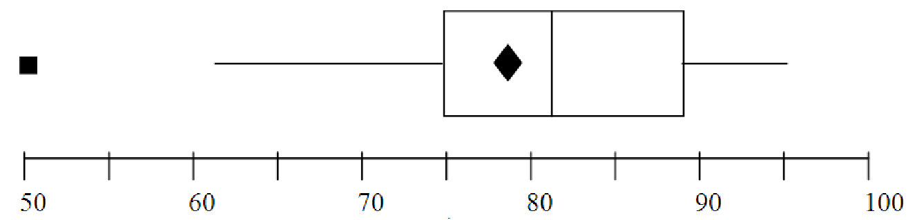
Figure 4.2: Boxplot of test scores
Example 4.4. Making a boxplot when there are an odd number of data points
Consider the list of test scores below:
| 55, | 60, | 67, | 70, | 78, | 81, | 84, | 88, | 90, | 95, | 99 |
We already determined that the mean of this data is 78.82 and the median is 81. We now divide the list into four equal parts to determine the quartiles. Start by dividing the data into two equal parts, as with finding the median. Then divide each of these into two equal parts. For this data, each quartile should include three data points, since there are 11 total. Notice that the middle data point, the median, is in both the upper half and the lower half of the data when we divide it up.
| Lowest 50% | Median | Upper 50%
| ||||||||||
| 55 | 60 | 67 | 70 | 78 | 81 | 84 | 88 | 90 | 95 | 99 | ||
| Lowest 25% | Lowest 25% | Lowest 25% | Lowest 25%
| |||||||||
We now have almost everything that we need to make the boxplot. We just need to check whether there are any outliers in this data. An outlier is more than 1.5 IQR from Q1 or Q3. The interquartile range (IQR) for this data is IQR = Q3 - Q1 = 89 - 68.5 = 20.5. Thus, outliers must be more than 1.5*20.5 = 30.75 from the quartiles. Outliers on the low end would be less than (Q1 - 30.75) = (68.5 - 30.75) = 37.75. Outliers on the high end would be greater than (Q3 + 30.75) = (89 + 30.75) = 119.75. Since there are no data points outside this range, there are no outliers in this data.
To make the boxplot, we simply draw an axis scaled from 55 to 99 (for ease of reading, let’s go from 50 to 100 in steps of 5). We then draw the box part of the graph, extending from Q1 to Q3. We put a vertical line in the box at the median. We add a star or a diamond for the mean, and then we extend the ”whiskers” of the box from the edges out to the minimum and maximum, since there are no outliers. The final result is shown in figure 4.2
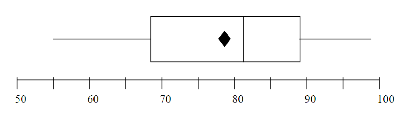
Example 4.5. Reading an Interpreting a Boxplot
Consider the boxplot shown in figure 4.3. It represents the distribution of test scores
in a class of 120 students. What can we learn about the class performance from this
graph?
To analyze the graph, we will consider a series of questions:
Example 4.6. Side-by-Side Boxplots
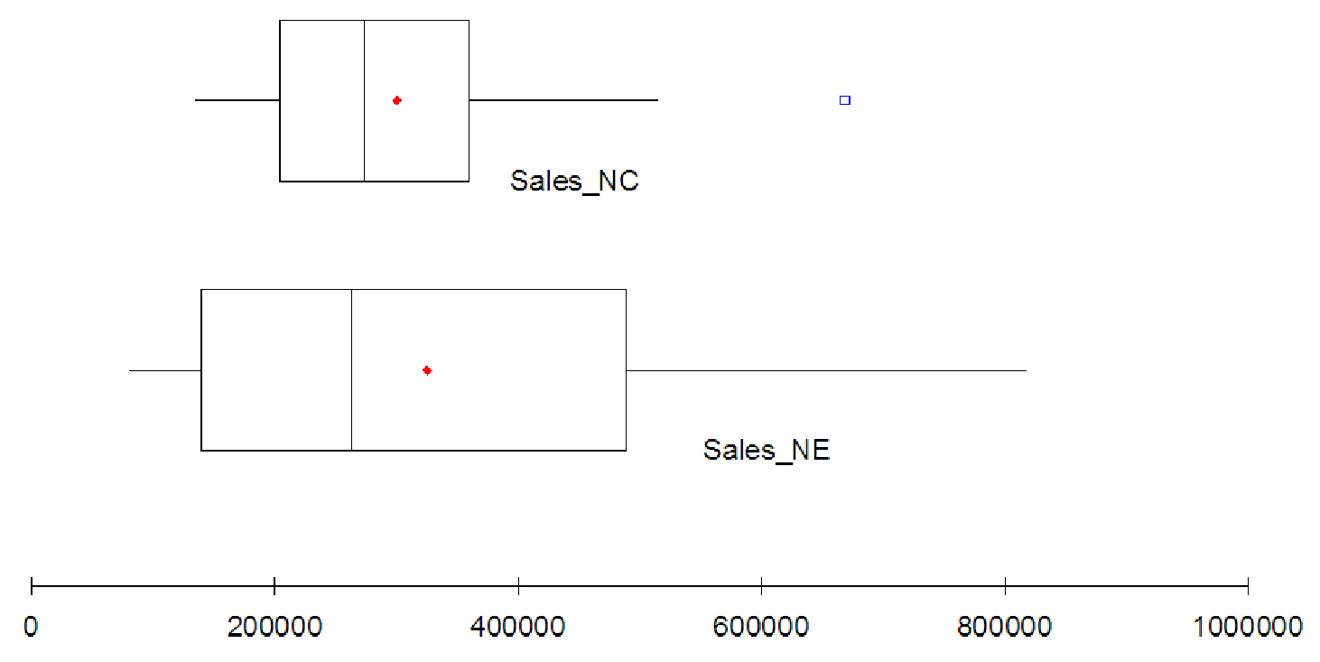
Consider the sales data given above in example 3. (Data file C04 Tots.xls [.rda].) Let’s use
boxplots to compare the two sales regions and select the region that has the better performance. If
you enter the data above into your software and create side-by-side boxplots you should get a
graph simlar to the one in figure 4.4.
As you can see, the boxplot shows that the sales in the North East region are spread over a much greater range of sales figures than the sales in the North Central region. In addition, the highest performing store in the NC region is an outlier and is not at all representative of the region’s performance. However, the lowest 25% of the stores in the NE region are performing worse than all of the stores in the NC region (the minimum for the NC region is about equal to the first quartile for the NE region). By the same token, the upper 25% of stores in the NE region seem to be doing better than all the stores in the NC region (the third quartile of NE region sales is about equal to the maximum for the NC region, if we ignore the outlier). The middle of each region seems to be about the same, with the medians of the two regions almost equal. The mean sales of the NE region (indicated by the small dot) are higher than the mean sales in the MC region, but not by a very significant amount.
Given just these graphs, it might be difficult to determine which region is performing better overall. In general though, it seems that the NE region has more stores performing well than the NC region. Also, the highest performing store is in the NE region. Overall, it looks like the NE region has better sales, but we must remember that the NE region has fewer stores, so each quartile refers to fewer data points. The real question is what is causing the NE region to do better. Is it better management? Less overhead? Wealthier clients? Better marketing? Better service? Some other factor?
Example 4.7. Skewness of data
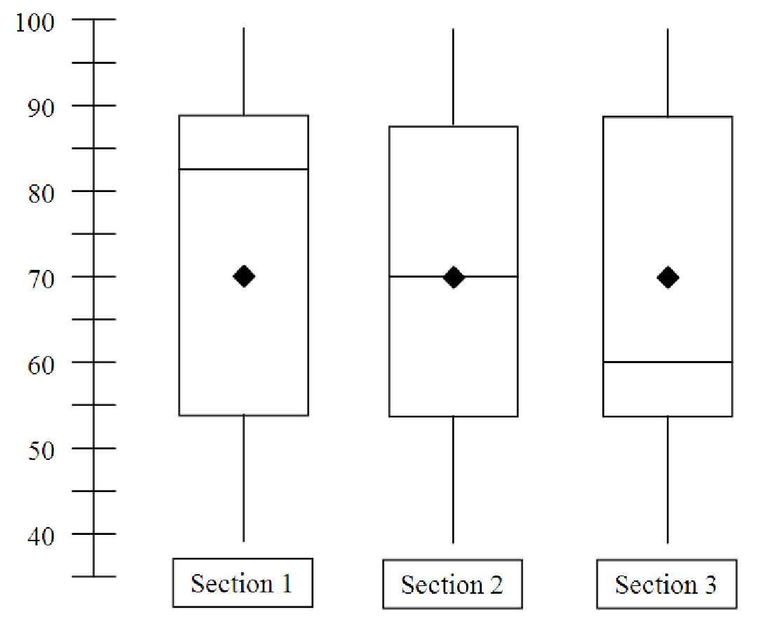
Generic University offers three sections of its math course for business majors. At the end of the
semester, all sections take the same final exam. The boxplots in figure 4.5 show the results of the
final separately for each section. The graphs are oriented vertically, rather than horizontally, just
for variety. As you can see from the graphs, the minimum scores are the same in each
section, as are the maximum scores and the means. Which section did best on the final
exam?
In order to decide which section did best on the final exam, we need to picture how the data itself looks, based on the boxplots. For example, the test scores in section 1 seem to be unevenly spread throughout the range of the data (low score: 40, high score: 99). We can tell this because the median of the data is very close to the upper end of the spread. Half of the students in section 1 scored above 83 on the exam. Even so, the overall mean of this section’s test scores was only 70 because the lower 50% of the class has scores from 83 on down to 40. This unevenness is referred to as skewness. When the mean is smaller than the median, we say the data is negatively skewed because the quantity (Mean - Median) would be less than zero. This is in stark contrast with section 3, where half of the students’ scores are bunched together at the low end of the spread, from 40 to 60, and the top half of the class has scores ranging from 60 up to 99. In this case, the mean is larger than the median, so the data is positively skewed. What about section 2? The data for this section doesn’t seem to be skewed at all; the mean and median are identical. This tells us that half of the students in section 2 scored above 70 and half of the students in section 2 scored below 70. Given all of this, it seems reasonable to conclude that section 1 had the best showing on the exam; more than half of the students in section 1 had exam scores above the median and mean scores of both sections 2 and 3.