7.1.1 Definitions and Formulas

Scatterplot
A scatterplot is a graph that takes sets of observations of two variables and plots them as points on a graph. Each point corresponds to a single observation of both variables. The points are identified by an ordered pair, with the horizontal variable listed first. These ordered pairs are written as (x,y). After each point in the data is plotted, the scatterplot can help determine if there is a relationship between the two variables.
Axis and axes
All graphs have an axis that shows a scale and in which direction the variable being graphed is increasing. ”Axes” is the plural form of the word axis.
Quadrants
In a scatterplot, the horizontal and vertical axis cross at a point called the origin which has coordinates (0, 0). This divides the Cartesian plane (all the possible points of the scatterplot) into four regions called quadrants. Each quadrant is numbered according to the graph in figure 7.1.


PIC


Figure 7.1: Diagram showing the labels for each of the four quadrants in an XY scatter plot. As usual, the x-axis runs left to right and the y-axis runs bottom to top.


Dependent Variable
The dependent variable is usually graphed on the vertical axis. This is the variable that you suspect will be affected by a change in the other variable.
Independent Variable
The independent variable is usually graphed on the horizontal axis. This is the variable that you suspect determines the value of the dependent variable. It is graphed on the horizontal axis because it is easier for the eye to scan left-to-right in picking a value for it and then scanning up the graph to determine the value of the dependent variable that corresponds to the value of the independent variable you picked.
Direct Relationship
If the cloud of points on the scatterplot seems to move upward as the eye scans across the graph from left-to-right (as shown in figure 7.2), then the relationship between the two variables is said to be a direct relationship. This means that as the independent variable increases (gets larger in value), so does the dependent variable. Such a relationship is also referred to as a positive relationship or an increasing relationship. The graph in figure 7.2 shows a strong positive relationship between two variables.


PIC


Figure 7.2: Illustration of a direct relationship between the dependent variable Y and the independent variable Y.


Indirect Relationship
If the cloud of points on the scatterplot seems to move downward as the eye scans across the graph from left-to-right (as shown in 7.3), then the relationship between the two variables is said to be an indirect relationship. This means that as the independent variable increases (gets larger in value), the dependent variable decreases. Such a relationship is also referred to as a negative relationship. The graph in figure 7.3 shows a strong negative relationship between the two variables graphed.


PIC


Figure 7.3: Illustration of an indirect relationship between the dependent variable Y, shown on the vertical axis as is standard, and the independent variable X on the horizontal axis.


Correlation coefficient
The correlation coefficient is a way of numerically determining two things:

  1. Whether the relationship between two variables is direct, indirect or neither.
  2. The strength of the linlear relationship between two variables.

Correlation is a number between -1 and +1 and is determined by the formula below, based on the z-scores of the two variables (the variables are called x and y in the formula).

                           n
                    --1---∑
Correlation(x, y) = n - 1    zxizyi
                          i=1

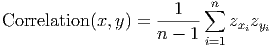
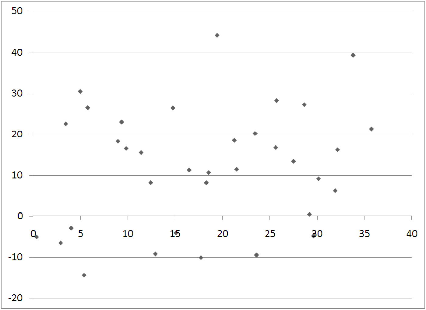
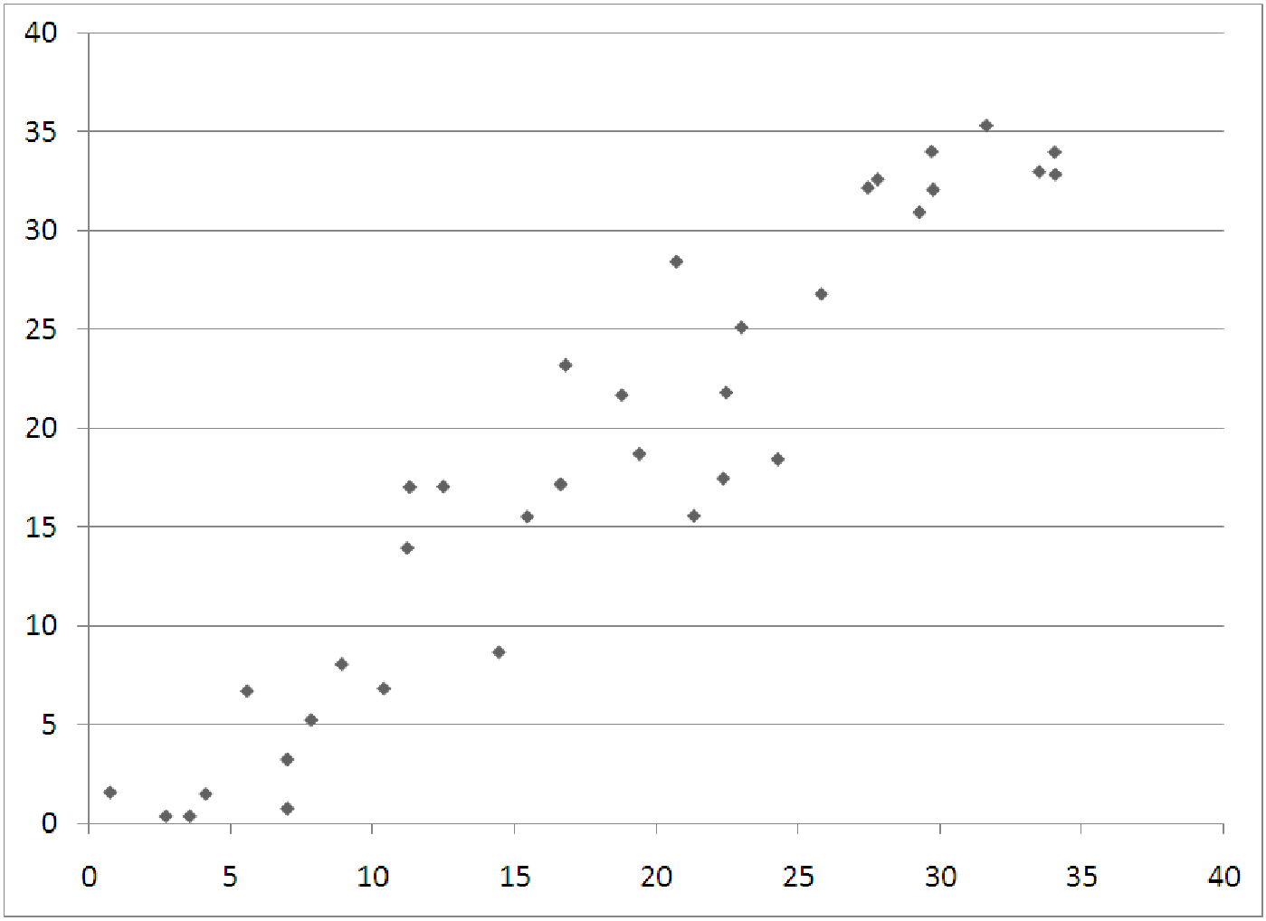
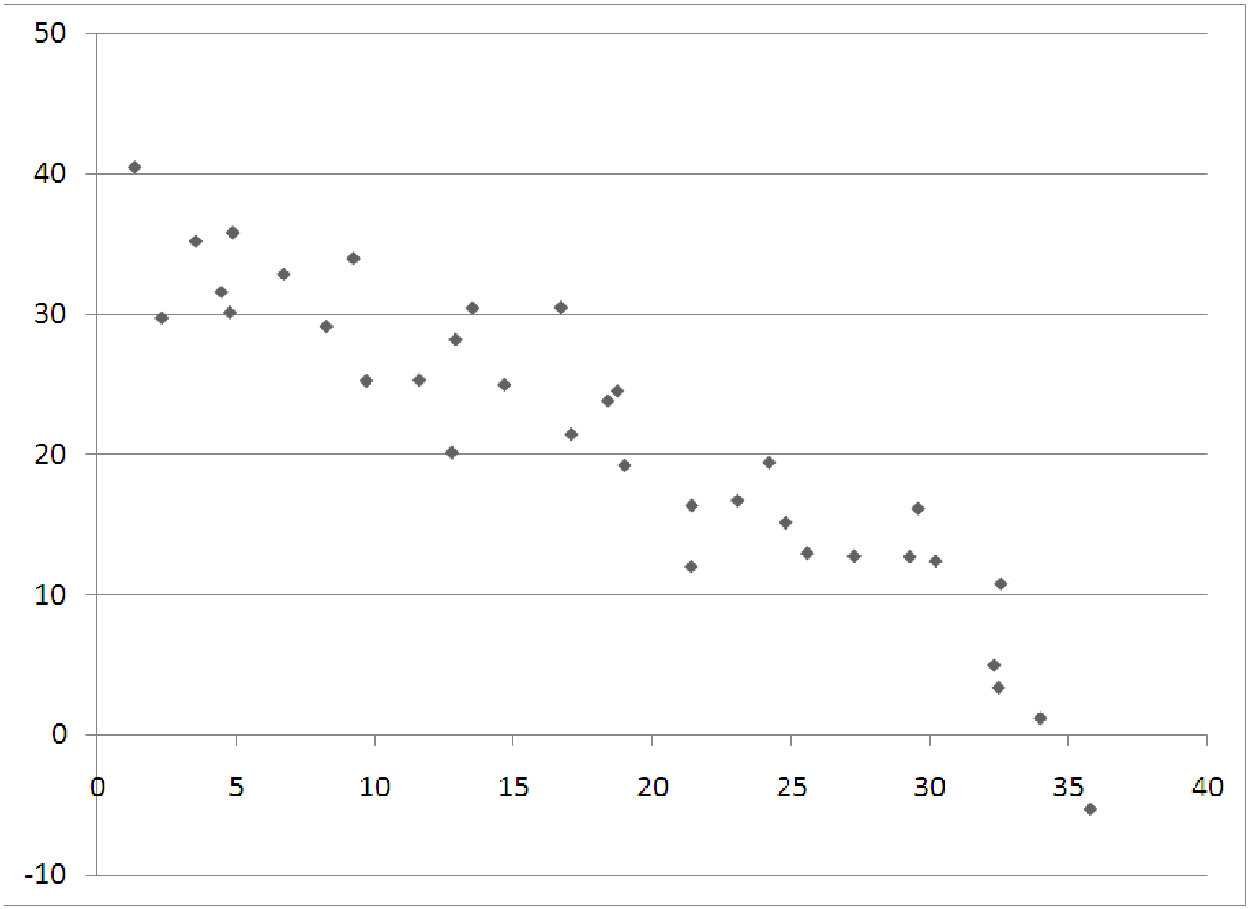
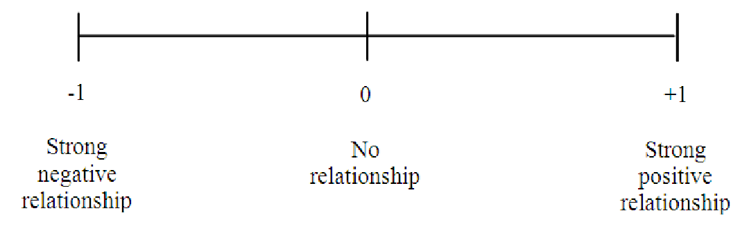
Notice that since this formula is based on the z-scores of the data, the overall correlation coefficient has no units. This makes it easier to interpret. Positive correlation means positive relationship, negative correlation means a negative relationship. Correlations close to +1 or -1 indicate strong relationships, while correlations close to zero indicate weak relationships, as shown in figure 7.4.


PIC


Figure 7.4: The scale of correlation, from -1 to +1.


Correlation Matrix
A correlation matrix (see table 7.1 for an example) shows the relationships among many variables at once in a table format. Each variable is listed twice - once along the top of the table and once along the side of the table. Each cell of the table contains the correlation between two variables (one from the row and one from the column the cell is in). Usually such tables are only half filled in, since the correlation of x with y is the same as the correlation of y with x. Also, the diagonal entries are all +1, since a variable has a perfect correlation with itself.


Table of correlations Age Credits WorkHours SleepHours GPA


Age 1.000


Credits 0.221 1.000


WorkHours 0.658 -0.439 1.000


SleepHours 0.775 -0.886 -0.228 1.000


GPA 0.342 0.669 -0.824 0.713 1.000


Table 7.1: Sample correlation matrix of relatinoships among the variables describing students at a large university.

Strong Relationship
A strong relationship between two variables is seen in scatterplots with points that are tightly bunched together around some pattern (like a line or a curve). The graphs shown above under ”Direct” and ”Indirect” relationships are both strong relationships. Strong relationships have correlations close to +1 or -1.
Weak Relationship
In a weak relationship, such as that shown in figure 7.5, there is almost no connection between the two variables. Figure 7.5 shows such a situation. This might result from graphing the two variables ”grade on a test” and ”amount of pizza consumed”. Weak relationships have correlations close to zero.


PIC


Figure 7.5: XY scatterplot showing a very weak relationship between the two variables.