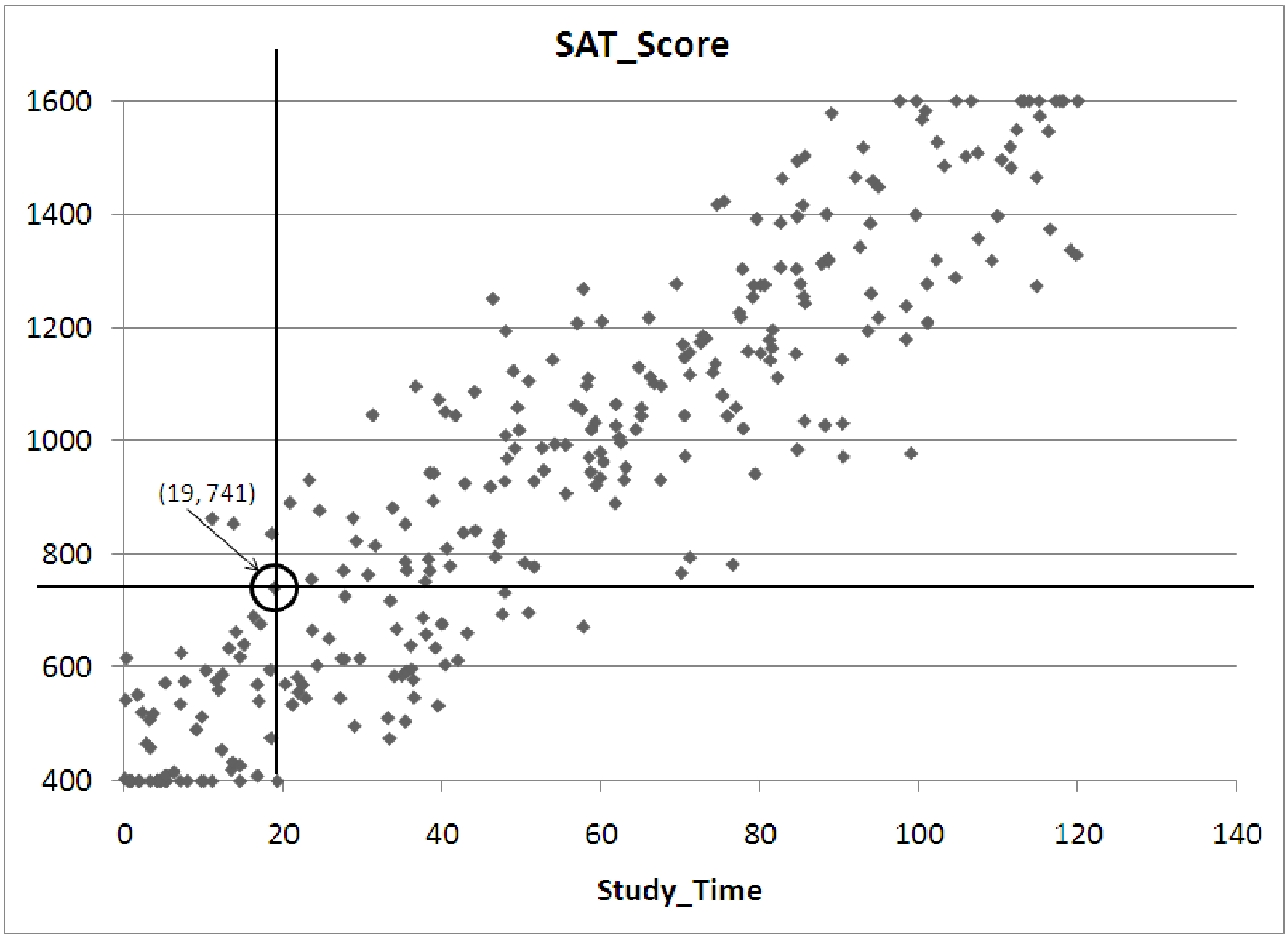
Figure 7.6: Scatterplot of SAT scores versus hours of study time.
Example 7.1. Reading Variables and Relationships from a Graph
Suppose we have collected data on students taking the SAT shown in figure 7.6. If we have
observations of the variables Study Time and Score, we might try to examine whether there is a
relationship between the amount of time a particular student studies for the test and the score that
this student receives on the test. We would then select Study Time as the independent
variable, since we are guessing that study time predicts the test score. To create the
scatterplot we then draw the axes and label them Study Time on the horizontal axis
and SAT Score on the vertical axis. Next, we select a scale for each axis, based on the
range for each variable. (Recall that the range is the difference in the maximum and
minimum observations.) Finally, for each observation, we place a dot on the graph. The
values of the two variables will determine where each dot is placed. For example, if
one student studied 19 hours for the test and scored 741 (on a scale of 400-1600), the
dot representing her score would be located along a line passing through the 19 hour
mark on the horizontal axis, and it would be lined up with the 741 mark on the vertical
axis.
After plotting all of the data on the graph above, it is clear that the variable Study Time has a strong influence on the final score a student receives on the SAT. The relationship looks quite strong and positive: as study time increases, students score higher on the test. Notice however, that the relationship is not perfect. There is a wide range of scores for students spending, for example, 20 hours studying for the test. In fact, all we can say for certain is that 20 hours of studying will probably get a score between 400 and 800 on the test. If we increase the amount of studying, though, the final score is quite likely to be higher. For example, 60 hours of studying seems to result in a score between 1000 and 1300.
Example 7.2. Reading a Correlation Matrix
Suppose we collect observations of several variables related to employees at Gamma Technologies:
Age, Prior Experience (in years), Experience at Gamma (in years), Education (in years past high
school), and Annual Salary. The matrix of correlations of such data might look like
this:
| Table of correlations | Age | Prior | Gamma | Education | Annual |
| Experience | Experience | Sallary | |||
| Age | 1.000 | ||||
| Prior Experience | 0.774 | 1.000 | |||
| Gamma Experience | 0.871 | 0.443 | 1.000 | ||
| Education | 0.490 | 0.362 | 0.308 | 1.000 | |
| Annual Salary | 0.909 | 0.669 | 0.818 | 0.650 | 1.000 |
To read the table, simply choose two variables and look up the intersection of those two variables in the table. If we choose Age and Gamma Experience, the correlation is 0.871. This number is quite high, indicating a strong positive relationship. Thus, we expect that older employees have been with the company longer. (This is not much of a discovery.) However, the strongest relationship between two variables in this study is between Age and Annual Salary. The correlation of 0.909 indicates that Age is an excellent indicator of salary: older employees make more money. Also, notice that the correlation between any variable and itself is always 1.000. You may also notice that the correlation of ”Prior Experience” with Salary is slightly higher than the correlation of Education with salary. This means that this company places slightly more importance on experience over education. The last thing to notice is that part of the chart is blank. This is because the correlation of the variable Age to Prior Experience will be the same as the correlation between Prior Experience and Age. There is no need to duplicate the information.
Example 7.3. Strong and Weak Correlation Through Pictures
Note: Before reading this example, you may wish to review the material on z-scores in section
5.1.
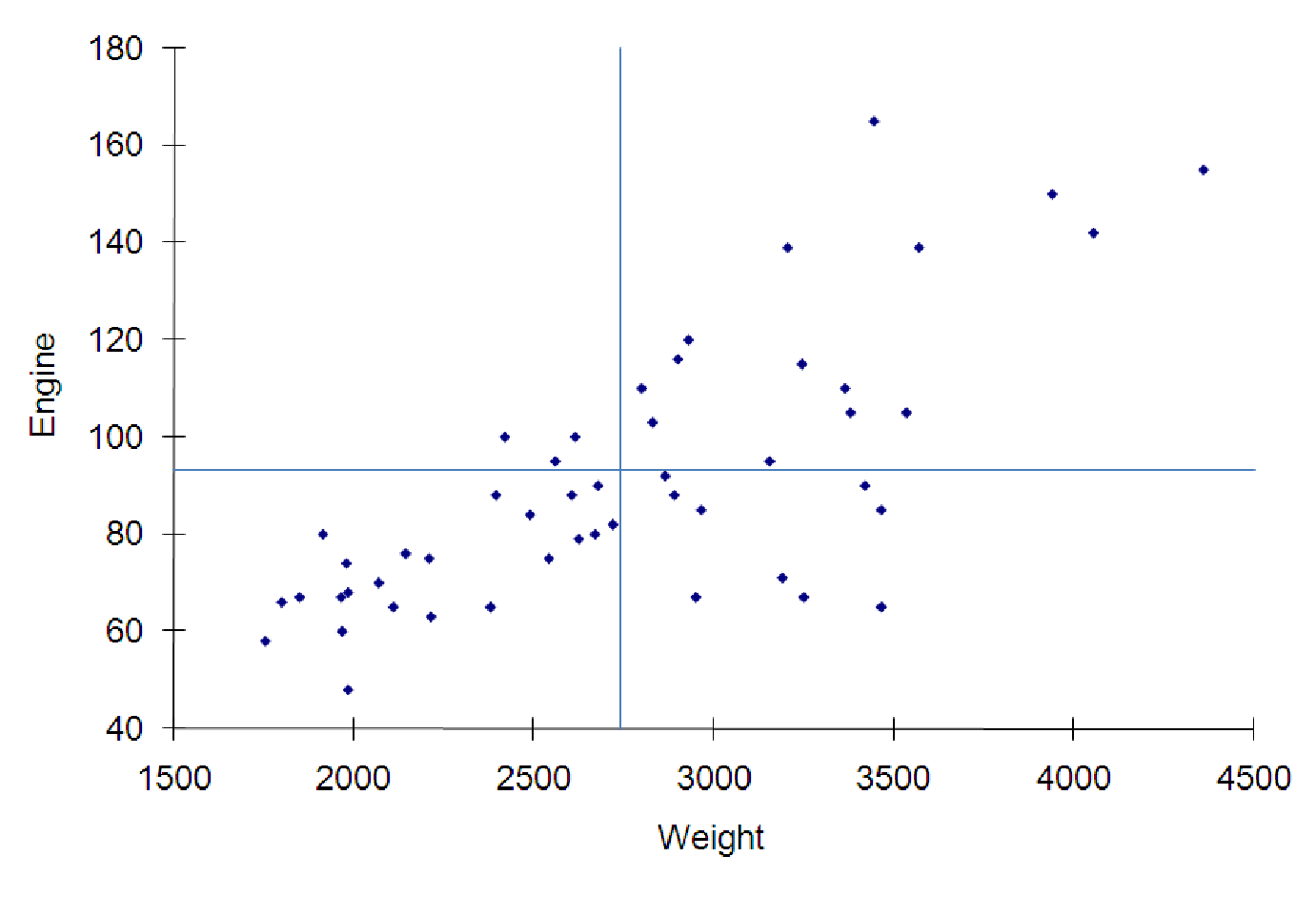
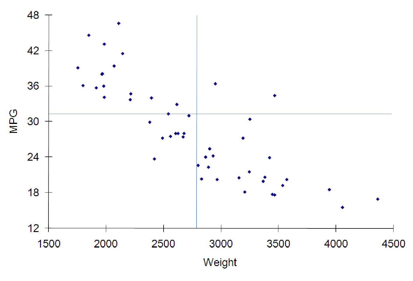
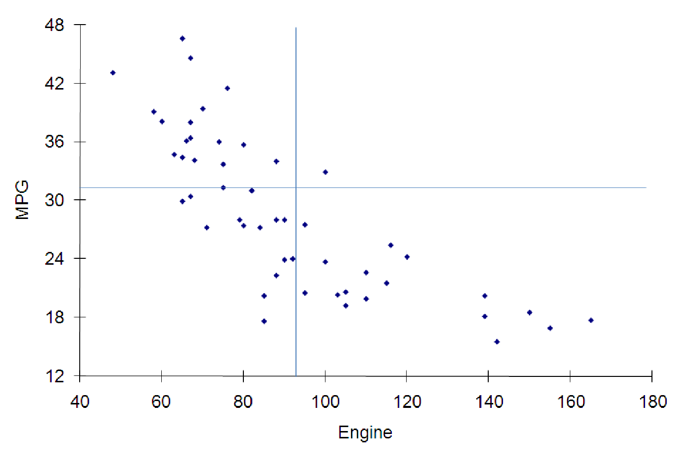
Consider the gas mileage for cars, a topic you may have spent some time thinking about recently. We have collected data on a sample of vehicles on the road in the file C07 AutoData.xls [.rda]. The data include the gas mileage (measured in MPG or miles per gallon), the power of the engine (measured in horsepower) and the weight of the vehicle (measured in pounds). What general conclusions can we draw from the data, as represented in the graphs and charts below? As you can see from the graphs, all three variables are strongly correlated. However, two of the relationships are inverse relationships: As the weight of the vehicle increases, gas mileage decreases. As the power of the engine increases, the mileage also drops. However, the positive relationship shows us that larger cars (as measured by weight) tend to have more powerful engines (by horsepower). Three graphs illustrating various relationships among variables about automobiles in figures 7.7, 7.8, and 7.9.
Which of these relationships is the strongest? This is much harder to tell from the graphs. It appears that all three of the relationships have very similar correlations (in magnitude). To estimate the correlations, we need to know the means of the three variables.
| Variable | MPG | Engine | Weight |
| Mean | 31.50 | 90.84 | 2756.52 |
Now, we can draw in the means (this has been done in the above graphs) and use this to estimate the correlation between the variables in each graph. In the ”Engine vs. Weight” graph, notice that most of the observations are in the upper-right and lower-left quadrants. This means that most of the observations will serve to increase the correlation coefficient. In the upper-right quadrant, zx > 0 and zy > 0 for each observation, so the product is also positive. In the lower-left quadrant, zx < 0 and zy < 0, so the product is also positive. However, there are a few observations in the upper-left quadrant which decrease the correlation (since the zx scores of these observations is negative and the zy scores are positive, this contributes a negative to the total correlation). There are quite a few observations in the lower-right quadrant which will also decrease the correlation (zx > 0, but zy < 0 for these). Based on this, we expect the correlation to be high and positive, but not perfect. A good estimate would be around 0.8.
Since the other graphs are similar in terms of spread, we expect their correlations to be the same magnitude as the first graph. Since they represent inverse relationships, though, these correlations must be negative. You could reasonably estimate the correlations to be about -0.8 for both graphs.
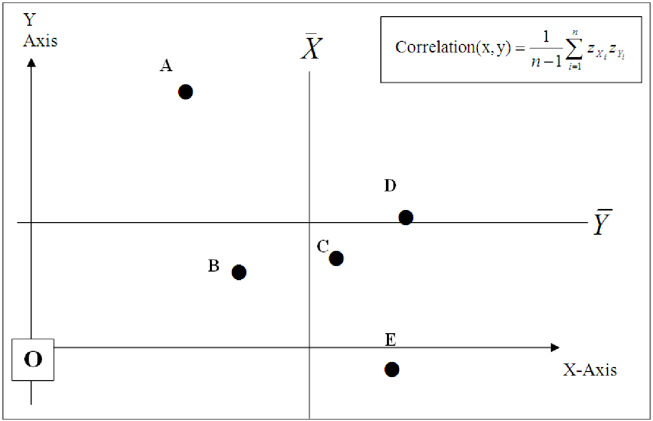
Example 7.4. How Correlation Works
Consider the data graphed on the scatterplot below. For each of the five data points, we can fill in the table below in order to estimate the effect of each point on the overall correlation of the data.
| POINT | Sign of Z score of Point’s x | Sign of Z Score of Point’s y | Sign of the products of the Z Scores | Increase or Decrease Correlation | Size of effect on correlation: No effect, a little, or a lot |
| A | Negative | Positive | Negative | Decreases | A lot |
|
|
|
|
|
| |
|
|
|
|
| ||
| B | Negative | Negative | Positive | Increases | A little |
|
|
|
|
|
|
|
|
|
|
|
|
|
|
| C | Positive | Negative | Negative | Decreases | A little |
|
|
|
|
|
|
|
|
|
|
|
|
|
|
| D | Positive | Negative | Negative | Decreases | No effect |
|
|
|
|
|
|
|
|
|
|
|
|
|
|
| E | Positive | Negative | Negative | Decreases | A lot |
|
|
|
|
|
|
|
|
|
|
|
|
|
|
So we see that four fo the five points contribute to a negative correlation, while one (B) increases the correlation. Point D has almost no effect on the correlation because the y-coordinate of D is almost equal to , makings its z-score basically zero. Overall, these data indicate a correlation of maybe 0.7 or so.