Figure 8.4: The various quantities involved in regression that are discussed above.
Example 8.4. Interpreting the quality of a model
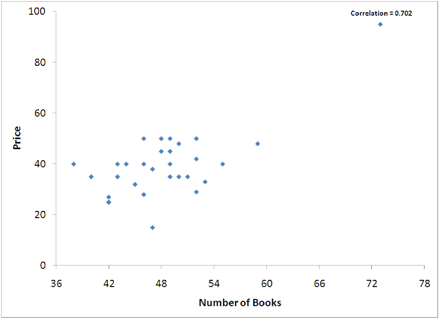
In the examples from section 8.1.2, we developed and explored a model for predicting the price of a
backpack based on the number of 5” by 7” books that it can hold inside. Using the data graphed in
figure 8.4, we can produce the regression output below.
| Results of simple regression for Price
| |||||||
|
| |||||||
| Summary measures | |||||||
|
| R-Square | 0.4931 | |||||
|
| StErr of Est | 9.8456 | |||||
|
| |||||||
| ANOVA table | |||||||
|
| Source | df | SS | MS | F | p-value | |
|
| Explained | 1 | 2640.4857 | 2640.4857 | 27.2397 | 0.0000 | |
|
| Unexplained | 28 | 2714.1810 | 96.9350 | |||
|
| |||||||
| Regression coefficients | |||||||
|
| Lower | Upper | |||||
|
| Coefficient | Std Err | t-value | p-value | limit | limit | |
|
| Constant | -30.6751 | 13.5969 | -2.2560 | 0.0321 | -58.5272 | -2.8231 |
|
| Number of Books | 1.4553 | 0.2788 | 5.2192 | 0.0000 | 0.8842 | 2.0265 |
Now we want to ask the question: ”How good is this model at predicting the price of a backpack?” We’ll start by examining the summary measures section of the output.
The R2 value for this model is not terrible, but it is pretty low, being only 0.4931. This means that the number of books can only explain 49.31% of the total variation in price. That leaves over 50% of the variation in price unexplained. This could be for many reasons:
Many times, the real reason is either #3 or #4. For example, our data and model do not include any variables to quantify the style of the backpack or its comfort when wearing it. Perhaps durability or materials are important variables. Maybe the name brand is important. Perhaps certain colors sell better. Perhaps certain extra features, additional pockets or straps for keys, are desired. Our data ignores these features. Essentially, our data tries to make all backpacks that are the same size cost the same amount of money. Clearly, this is not realistic. Given all these problems, though, an R2 of 49% is not too bad. So, we might be able to convince ourselves that the model is useful.
The standard error of estimate for this model is about $9.85. We can interpret this to mean that our equation will predict prices of backpacks to within $9.85 about 68% of the time, or to within 2 × $9.85 = $19.70 about 95% of the time. That wide range in the predicted prices is probably due to other variables that are important (see point #3 above). Notice that Se is always measured in the same units as the y-variable. This means that there is no ”hard and fast” rule for what constitutes a good Se. Our advice is to always compare Se with the standard deviation of the response variable, since this tells us how accurate our simplest model, the mean, is for the data and we want to do better than that with our regression model. For these data, the standard deviation of Price is $13.59. This means that if we just used the average price ($39.67) as our model for backpack price, we would be less accurate than if we used the regression equation which at least accounts for the size of the backpack. In general, a good model will have Se much less than the standard deviation of the y-variable.
Example 8.5. Computing R2 from the ANOVA Table
What does the ANOVA table tell us? It actually tells us quite a lot, but for this text, we will only
examine the first two columns of the ANOVA table. These are marked df and SS. These stand for
degrees of freedom and sum of squares. Notice that the degrees of freedom that are explained
is 1. This is the number of explanatory variables used in the model. Degrees of freedom that are
unexplained is the number of observations, n, minus the explained degrees of freedom, minus one
more for the y-intercept. Thus,
Df (explained) + Df (unexplained) + 1 = n
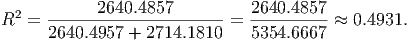
The sum of squares tells you how much of the total variation is explained and how much is unexplained. In this model, the amount of variation explained by ”number of books” is given by SSE which is 2640.4857. The unexplained variation, SSR, is 2714.1810. This means that the total variation (SST) in y is 2640.4857 + 2714.1810 = 5354.6667. Thus, to calculate R2, the fraction of the total variation in y that is explained by x, we simply compute a ratio:
Note that R2 is also given by (SST - SSR)/SST. And since SST = SSE + SSR, we can rewrite this as ((SSR + SSE) - SSR)/(SSR + SSE) = SSE/(SSR + SSE). So you have several ways to estimate R2 from the ANOVA table.
Example 8.6. Reading the Diagnostic Graphs
Let’s examine the diagnostic graphs for the backpack model. There are two of these that are
important. The first is the ”Fitted versus Price”. This graph is a scatterplot of all the fitted or
predicted data (ŷi) versus the corresponding actual data (yi). If the model predicted 100% of the
variation in backpack prices (R2 = 1) then each predicted value would equal the corresponding
actual value, and the scatterplot would show a perfectly straight line of points with a slope of 1
and y-intercept of 0. The further the scatterplot is from such a line, the worse a fit the
regression model is for the data. In this case, we get an interesting graph. The graphs in
figure 8.5 show a rough trend like this, but there is a lot of spread around the ”perfect
line”.
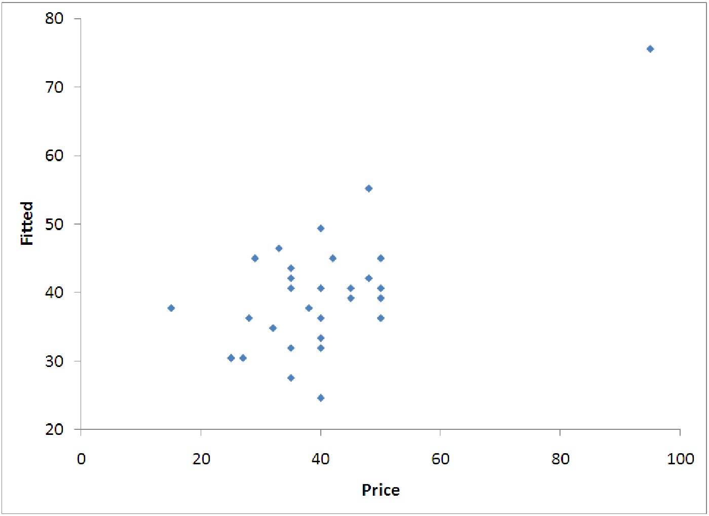 |  |
RULE OF THUMB: When looking at the graph of fitted values versus actual values, there is no perfect explanation for how close to a straight line the graph needs to appear for the model to be ”good.” Notice the graph shown on the left in figure 8.5 does not really look much like a straight line. In fact, if it were not for the lone data point far to the upper right, it might almost not look linear at all. The most important thing to do is not to make any absolute judgements about whether the model is good or bad; instead, focus on using the graph to explain potential problems with the model. Use the graph to describe the model’s features. For example, in the graph above, we see that the model is not very accurate - for the most part, the data is randomly spread around the model results, with only one point really making the model behave linearly. This one data point’s effects are called leveraging and this will be addressed in the exploration.
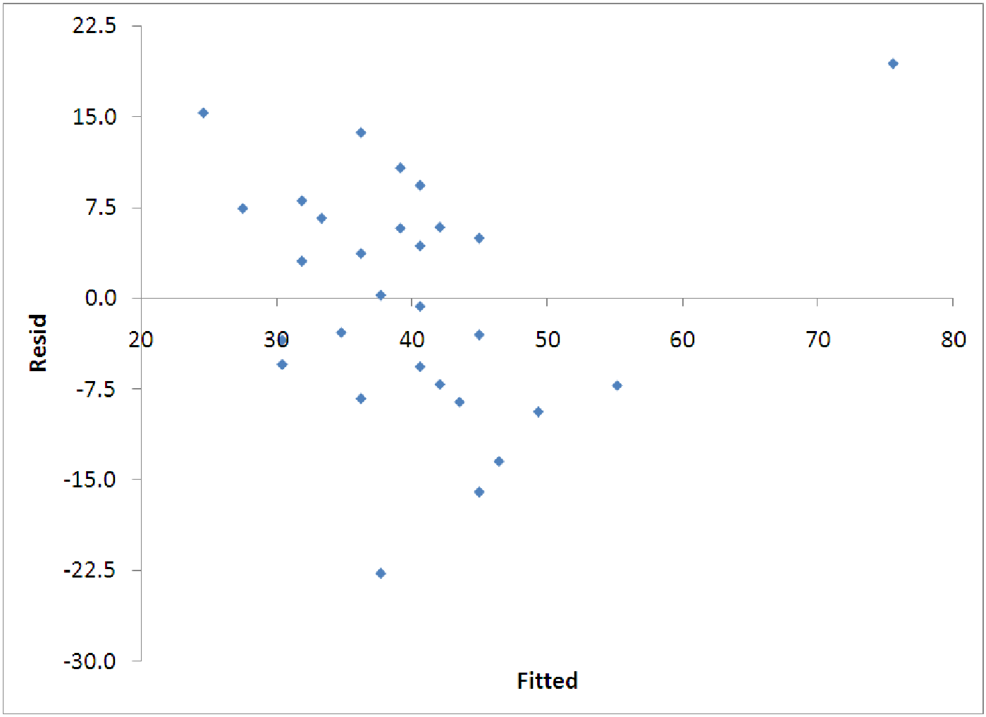
The other diagnostic graph that is important is the graph of the residuals versus the fitted values. For this graph, we want to see the points randomly splattered around with no pattern. If there is a pattern to the points on this graph, we may need to try another kind of regression model, some sort of nonlinear equation. This will all be explained in more detail in later chapters, but for now, you should at least look at these graphs and try to determine whether they indicate that the model is a decent fit or not. We want the following to hold: