 | 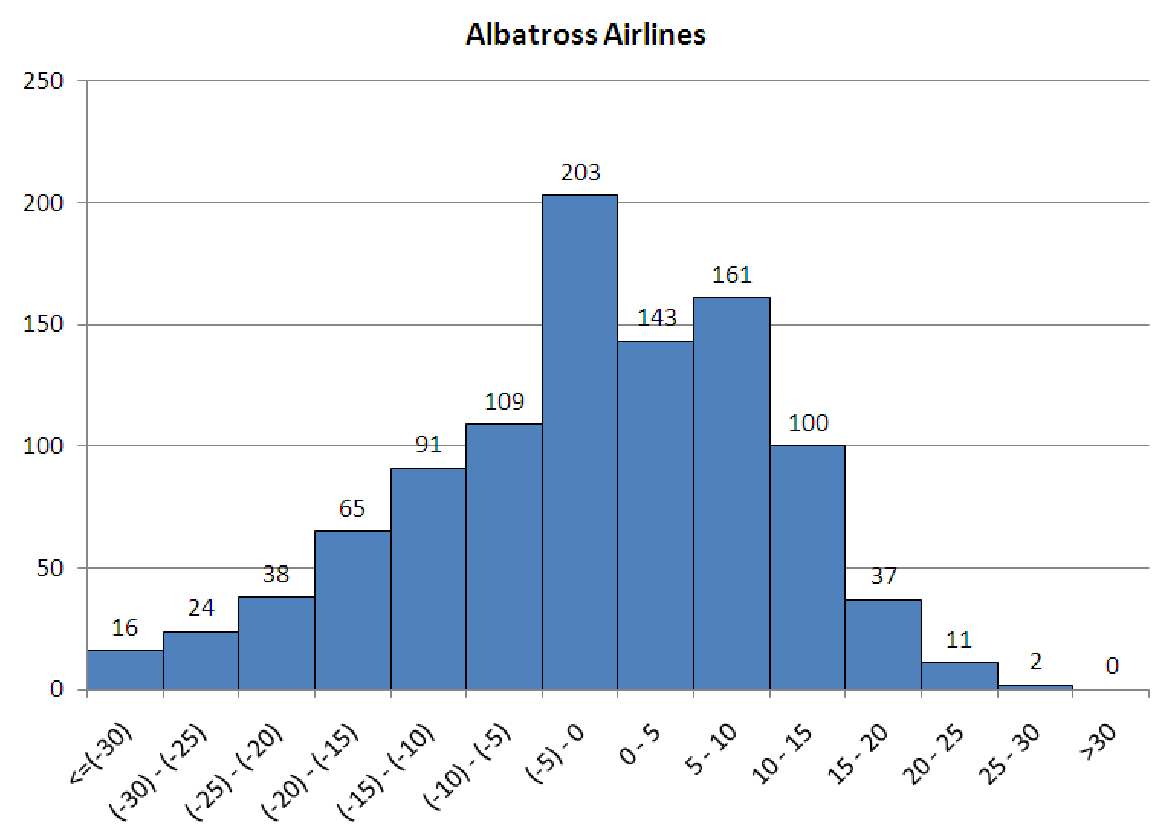 |
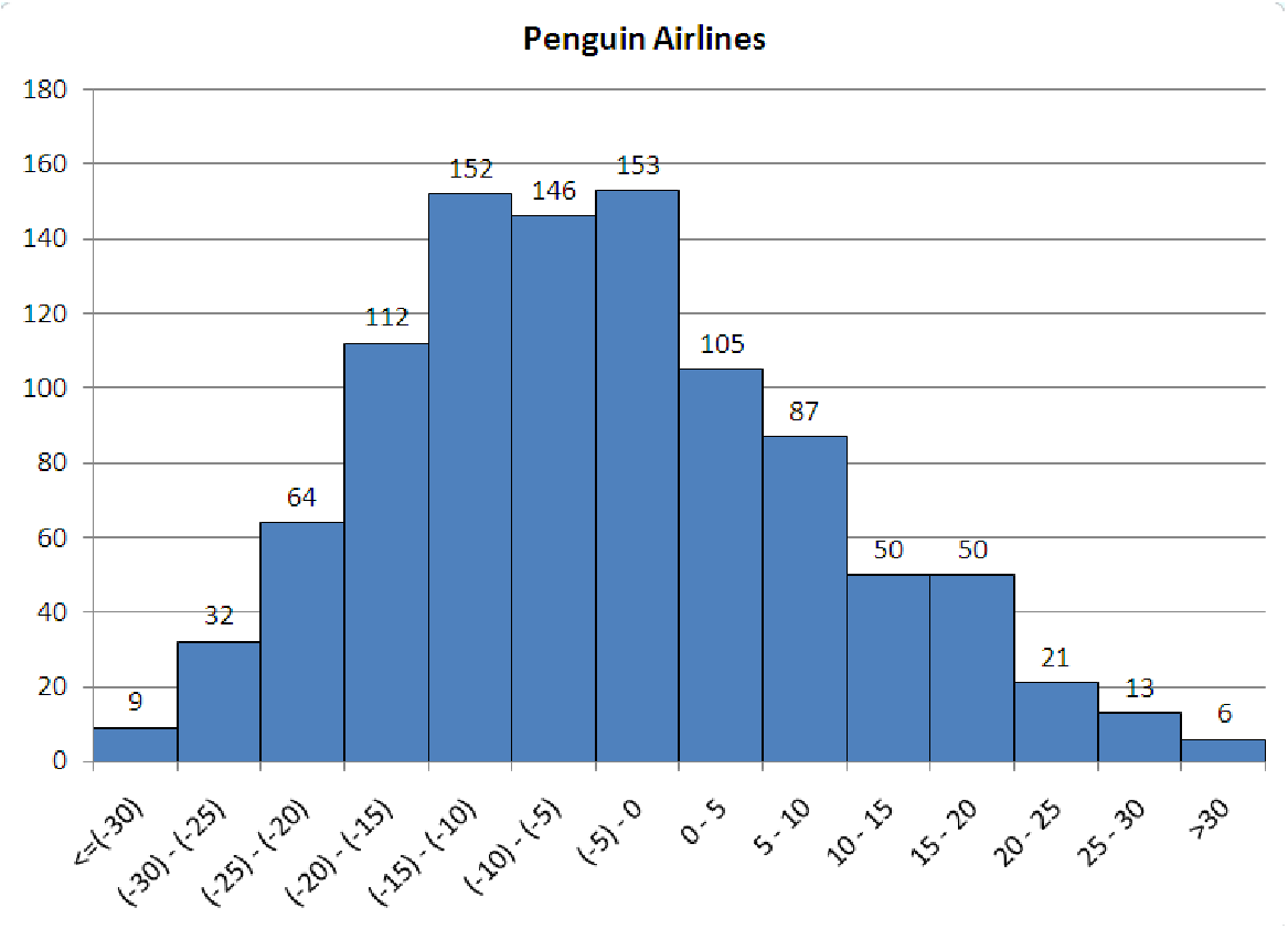
Figure 5.9: Histograms for Application and Reasoning problem 5.
5.5. The histograms in figure 5.9 show flight arrival data for two airlines your company is considering signing a permanent contract with. Both airlines offer similar flight times, similar service, and travel to all of the same cities. For 1,000 flights on each airline last year, the data is a record of how far before or after the scheduled arrival time that the flights actually arrived. Negative times indicate that the flight landed ahead of schedule. Positive times indicate late-arriving flights. For each of these graphs, construct both a cumulative distribution graph and a boxplot. Based on these data and your graphs which airline would you be willing to pay more for? Explain your reasons.
5.6. Over Easy, a breakfast restaurant, has collected data on the number of customers the restaurant serves each day of the week for a full year. Assume these data are normally distributed with a mean of 135 and a standard deviation of 22. They want to use this information to determine staffing for the restaurant.
5.7. You are the manager of a local grocery store and would like to collect data on the checkout times for customers in order to help inform staffing and the arrangement of your various express and standard checkout lines. You expect about 1000 customers each day and plan to measure the checkout time as being the total time elapsed from when the cashier starts scanning the first item to when the customer leaves with his/her groceries. Sketch a reasonable histogram of the checkout times, paying particular attention to the shape of the distribution and the units on the axes. Make sure that each axis is labeled and that each bin of the histogram is labeled with reasonable values for this situation. When you have a reasonable graph, write a short (2-3 sentence) paragraph explaining why you expect the checkout times to have the distribution you have drawn (left/right skewed, uniform, symmetric, bimodal).
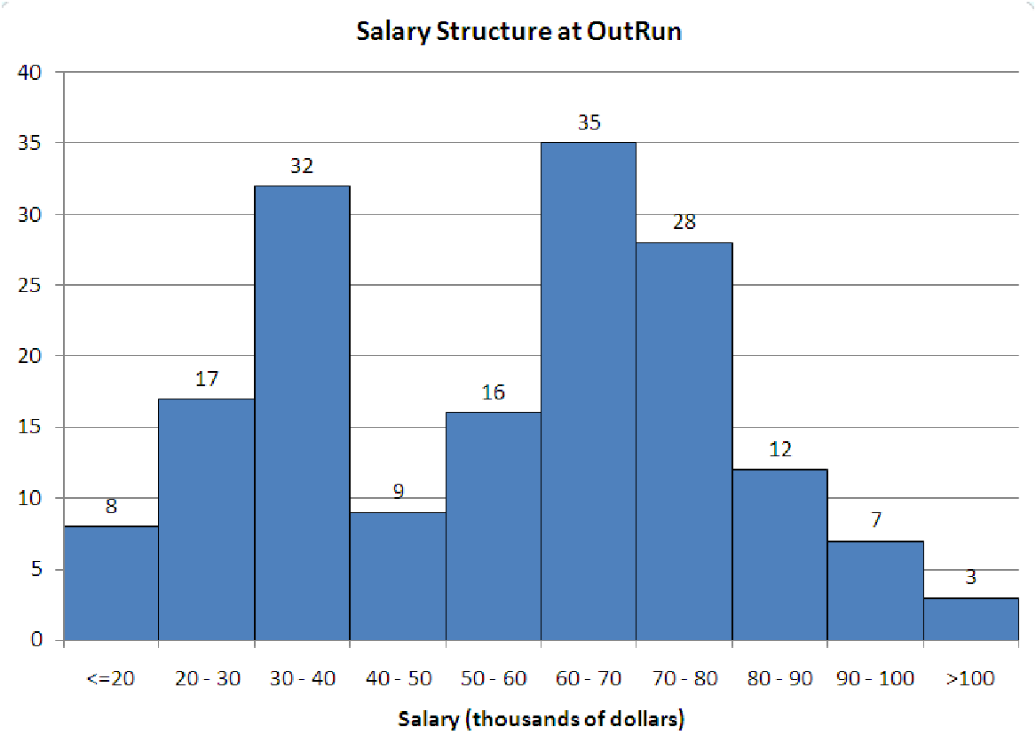
5.8. Consider the salary distribution for a company named OutRun shown in figure 5.10.
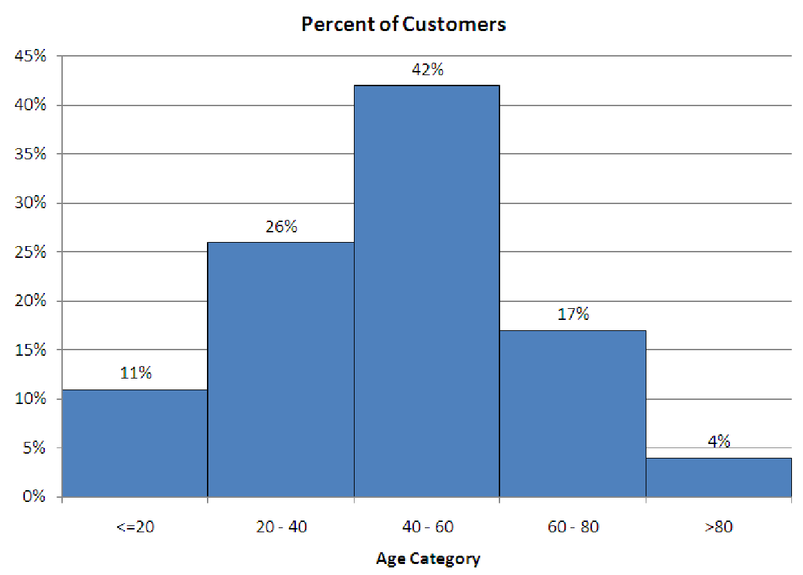
5.9. Consider the histogram below, made by one of your co-workers to represent the age distribution of customers at your company. This person claims that the graph supports the idea that most of their customers are neither young nor old and do not have children at home, which will help you decide when and where to do your advertising. Answer the following questions.