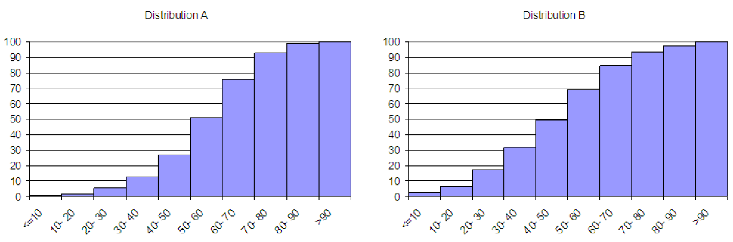
Figure 6.12: Compare these two distributions in problem 5.
6.5. Two cumulative distributions are shown in figure 6.12. Describe the differences between the two underlying histograms from which these cumulative distributions were constructed.
6.6. During a recent meeting at your company, the group is examining the breakdown of customers, based on income (see the file C06 Frequency.xls [.rda]). The coworker presenting the data claimed that the company’s average customer has a mean income over $80,000. This coworker then proceeded to explain how this would impact the company. But you suspect something is not quite complete in your coworker’s analysis, so at a break in the meeting, you modify the data file as shown to help you explore how the estimated mean and standard deviation change with different assumptions about the distribution of the data. At the top of the spreadsheet is a parameter labeled ”Mid”. This is a number between 0 and 1 (like 0.25) that represents how far from the left (as a percentage of the total bin size) you would like to position the ”midpoint” of the bin for estimating the mean and standard deviation. The rest of the data table is set up similarly to the one shown in example 4 to estimate the mean and standard deviation.
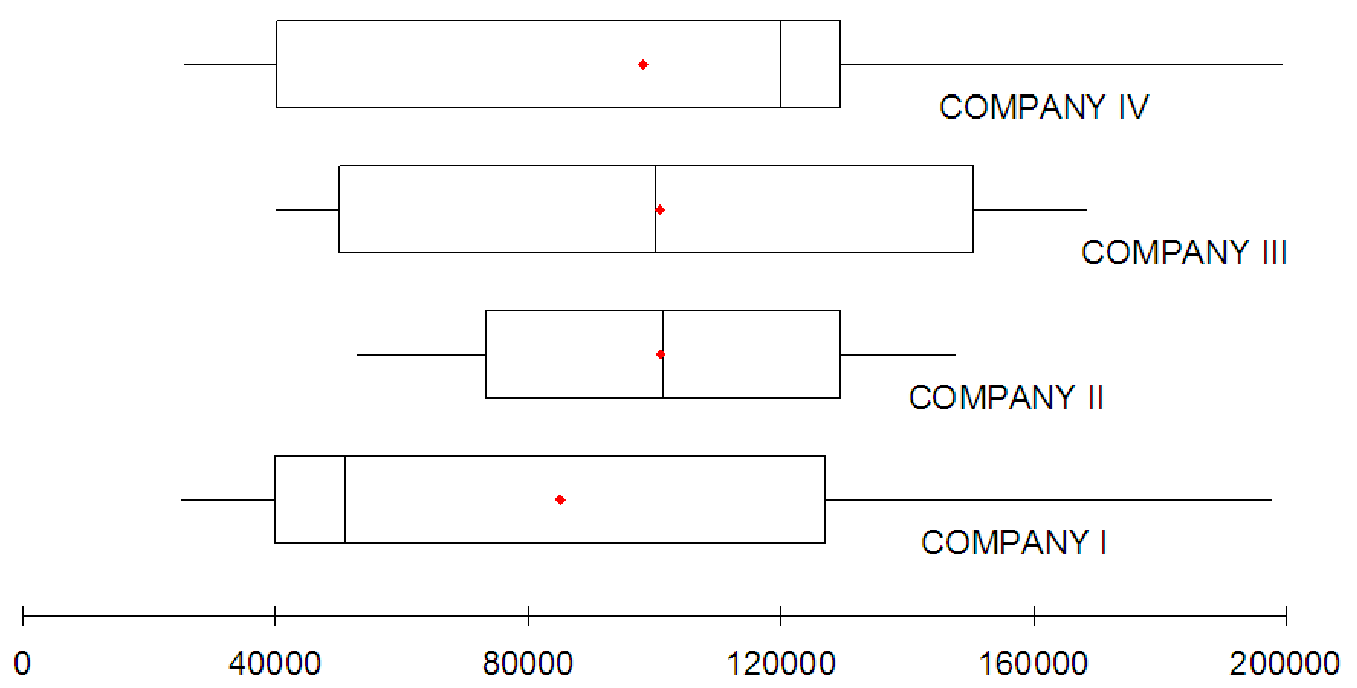
6.7. The graphs in figure 6.13 show boxplots of employee salaries at four local companies. Based on these boxplots, describe the shape of the histograms of the salaries. Estimate values for the minimum, the number of categories, and the category length that would help create a decent histogram of the salary data.