5.2.1 Definitions and Formulas

Frequency Table
Sometimes it may be useful to group the data together into subgroups (called bins, see below). To do this, you simply count how many observations fall into each bin. This count is called a frequency. When you have all of the observations placed into bins, the entire list of bins and frequencies is a frequency table for the data.
Bins
A bin is one of the ”boxes” in which data are placed to make a frequency table. Typically bins are all the same size or cover the same number of categories. For example: Ages of people could be divided into bins like 10-19, 20-29, 30-39, etc. You could also divide the ages into 0-19, 20-39, 40-59, etc. Each of these intervals is a bin into which observations are placed. Think of this as making a bunch of boxes, each labeled with a range of values. If an observation falls inside that range, place a counter into the box. When you have finished doing this for all the observations, you will have a frequency count for the data.
Distribution
In the sense that we are referring to it in this text, distribution refers to the way the data is spread out or bunched together.
Histogram
A histogram is a graphical representation of a frequency table. It shows the bins along the horizontal axis and has bars above each bin. The height of each bar represents the number of observations that fall in that bin. Histograms can be made directly from data using most software packages, or by first creating a frequency table and generating a bar graph.
Skewness
Skewness measures how far the distribution of data is from being symmetric. The actual formula for skewness uses the z-scores of the data and is a little ugly:
                   n       ∑n
Skewness  = --------------    z3i
            (n - 1 )(n - 2 )i=1

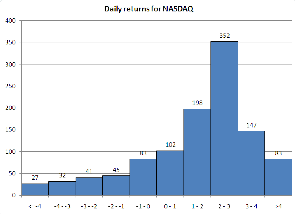
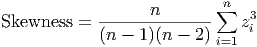
compares the data to the mean. If most of the data is less than the mean, then the skewness will be negative. If most of the data is greater than the mean, then the skewness is positive. The reason for this behavior is the exponent of three: data points far from the mean (and thus having a large deviation and a large z-score) will affect the total more than points close to the mean. In a positively skewed data set, the smallest values are much closer to the mean than the largest values, so the large positive deviations are made even larger by cubing them. The opposite happens for negatively skewed data.

Uniform Distribution
A uniform distribution (figure 5.1) has roughly the same number of observations in each bin. It looks almost flat, with each bin having almost the same height:


PIC


Figure 5.1: A histogram of uniform data.


Symmetric Distribution
A symmetric distribution (figure 5.2) has equal amounts of data on each side of a central bin. As you move farther from the central bin in either direction, the same number of observations (approximately) can be found.
Positively Skewed Distribution
A positively skewed distribution (figure 5.2) has more data on the left side of the mean. Typically, the skewness of such distributions is positive, and the median is less than the mean. The ”tail” of the distribution points toward increasing values on the horizontal axis.
Negatively Skewed Distribution
A negatively skewed distribution (figure 5.2) has more data on the right side of the mean. Typically, the skewness of such distributions is negative, and the median is more than the mean. The ”tail” of the distribution points toward decreasing values on the horizontal axis.
Bimodal Distribution
A bimodal distribution (figure 5.2) has two major peaks in it (there are two modes to the data, hence the term bi-modal). There is usually a gap between the peaks with fewer observations.


PIC PIC
A histogram of symmetric data. A histogram of bimodal data.
PIC PIC
A histogram of positively, or right-skewed, data. A histogram of negatively, or left-skewed, data.

Figure 5.2: Illustrations of the major types of distributions of data.