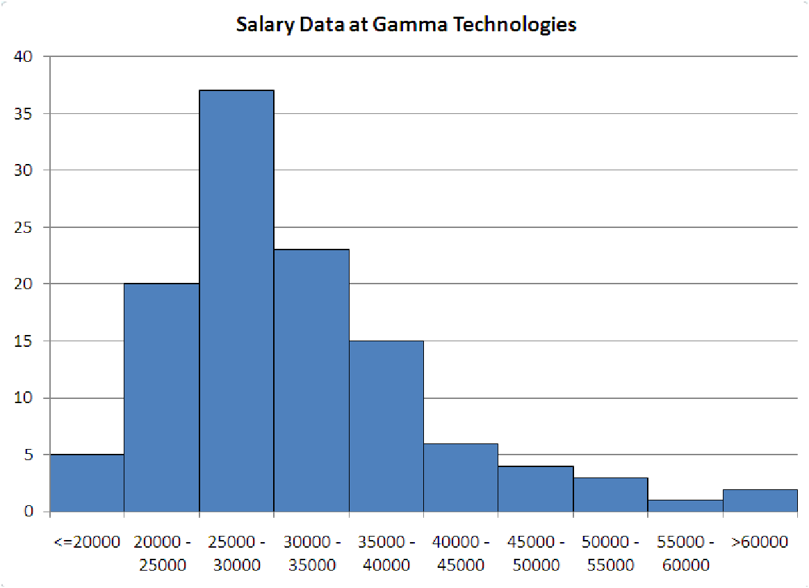
Figure 5.3: Salary distribution at Gamma Technologies, showing a distinct positive
skewness.
Example 5.4. Reading a Histogram
Look at the data shown in the histogram below. What can we learn about the data? First of all,
notice the bins; they are labeled below the bars on the graph. Each bin is the same width as the
others, with the exception of the two ends. These are open-ended so they can catch all the
observations that are outside the main bulk of the data. When you make a histogram in many
software packages, you control three things about the format of the graph: the minimum value
(which is really the upper end of the first bin), the number of bins (which includes the two ends!)
and the width of each bin. Consider the histogram shown in figure 5.3, which is an example of a
positively skewed histogram.
It seems that whoever created this graph used the following settings to make the graph:
| Minimum | 20,000 |
| Number of Categories | 10 |
| Category Width | 5,000 |
Notice that even though the minimum is set at 20,000, the first bin contains all the observations less than this number. What else can we see? First off, we notice that there are a total of 116 observations in this data. The bin with the most observations is the 25,000 to 30,000 bin, containing 37/116 = 31.90% of the observations. Most of the observations fall in the bins between 20,000 and 35,000, with a total of 20 + 37 + 23 = 80 or about 68.97%. Because the data has such a long tail in the direction of increasing salaries, this graph is said to be positively skewed. This means that the mean is larger than (to the right of) the bulk of the data. Think of it like a teeter-totter. Try to find the point along the axis where the histogram would balance. Start in the 25,000 -30,000 bin. The bins on either side of it are roughly equal, so don’t move the balance point. Now the next bins out (<= 20, 000 and 35,000 - 40,000) are very unequal, with more of the weight on the right. This pulls the mean to the right of our starting point. All of the other bins are even more unbalanced, so the mean is pulled far to the right of the highest peak. All of this tells us that the measures of ”typical” for this data are a little skewed. If we report the mean, which is approximately $34,000, then we are ignoring the skewness of the data. More than half of the data, 85 out of 116 points, is less than the mean, while only 31 points are greater than the mean. So, in what way is the mean a measure of ”typical” for this data? On the other hand, the median is slightly less than $30,000, with exactly half of the data above and below it. In the next section, chapter 6B, we’ll look more closely at how to read off statistics from a histogram. As it turns out, almost all of the observations in the last three bins are outliers.
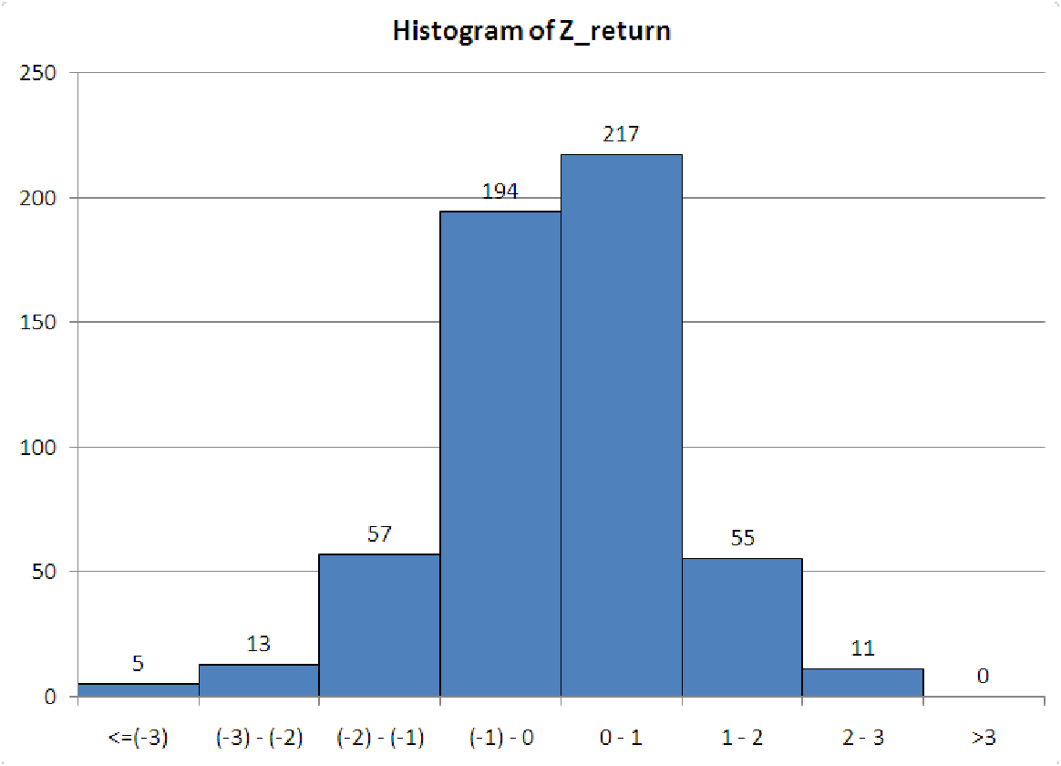
Example 5.5. Using histograms to check rules of thumb
By making a histogram of z-scores, we can check to see if the data is normally distributed. First,
compute the mean and standard deviation of the data. Then create a column of z-scores for
the data. Now, when you make the histogram, we make it with the following options
:
| Minimum | -3 |
| Number of Categories | 8 |
| Category Width | 1 |
This will ensure that you have the following bins for the z-scores:
| First Bin: | <= (-3) |
| -3 to -2 | |
| -2 to -1 | |
| -1 to 0 | |
| 0 to 1 | |
| 1 to 2 | |
| 2 to 3 | |
| Last bin: | > 3. |
The graph in figure 5.4 shows such a histogram for data taken from the stock market (daily returns of a particular stock for about two years).
Notice that since the mean has a z-score of zero, the mean of the data will always fall in the middle of a z-score histogram, between the fourth and fifth bins. Each bin is one standard deviation wide, so we can now compare the frequency counts of the data to the expected frequency counts from a normal distribution (see chapter 3B).
First, is the distribution symmetric? This graph is pretty close to being symmetric. The two central bins are close in height, as are the bins on either side of the central peak. The bin marking 2 to 3 standard deviations below the mean and the bin marking 2 to 3 standard deviations above the mean are about equal in height. The only parts that don’t match are the ends. There should be very little data in these two bins anyway (less than 0.3%), and both are close to zero.
Second, does the rule of thumb hold for this data? Let’s check it out.
Overall, this data is close to the rule of thumb, but seems to have too much data within one standard deviation of the mean, so we would probably conclude that this data is not from a normal distribution.
Now the question you’ve been waiting for: Why do we bother checking if the data is from a normal distribution? The main reason is related to the statement we made about normal distributions in chapter chapter 3: ”Statistically speaking, characteristics of a population (such as height, weight, or salary) are what are called normally distributed data.” Suppose that we conducted a customer satisfaction survey. Part of the survey would likely contain demographic data on the ages, incomes, and so forth of the customers. This is to ensure that the conclusions we draw about their satisfaction are accurate conclusions. We would expect that, if we properly sampled the customers, the demographic data would be normally distributed around some mean with some standard deviation. If this is not the case, then we are getting too much satisfaction data from some group or groups. This could completely invalidate our conclusions. A famous case of this type of mistake occurred with Literary Digest in 1936. The magazine surveyed its viewers about the upcoming presidential election. The survey overwhelmingly favored the Republican candidate, who lost by a landslide in the election. The magazine failed to consider that their audience was not a good sample of the entire U.S. population: their readers were mostly high-income families in an era of economic depression where most families could not afford the money to subscribe to a literary magazine.
Example 5.6. The Good, the Bad, and the Ugly
There are four ways for a histogram to ”go bad”. By this, we mean that the histogram does not
tell you everything it could tell you about the data. Each of these four cases is described
below. When making your histograms, if you see graphs like those below, you should try
to correct the problem. There are three numbers you can manipulate when building
histograms: the minimum value, the number of bins/categories, and the width of each bin
(sometimes called the category length). To fix the histogram, simply change one or more
these values to adjust the shape. Try several combinations out before you settle on a
particular graph. Use each graph you make to help choose better values for the next
graph.
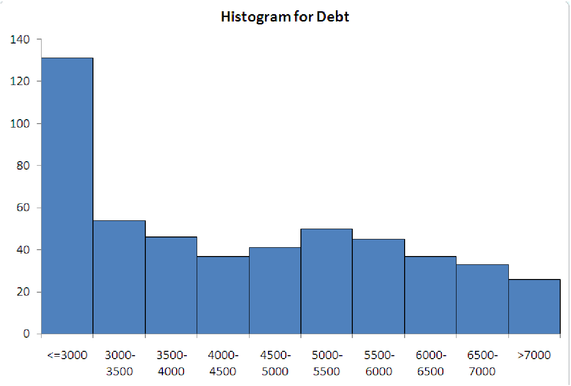
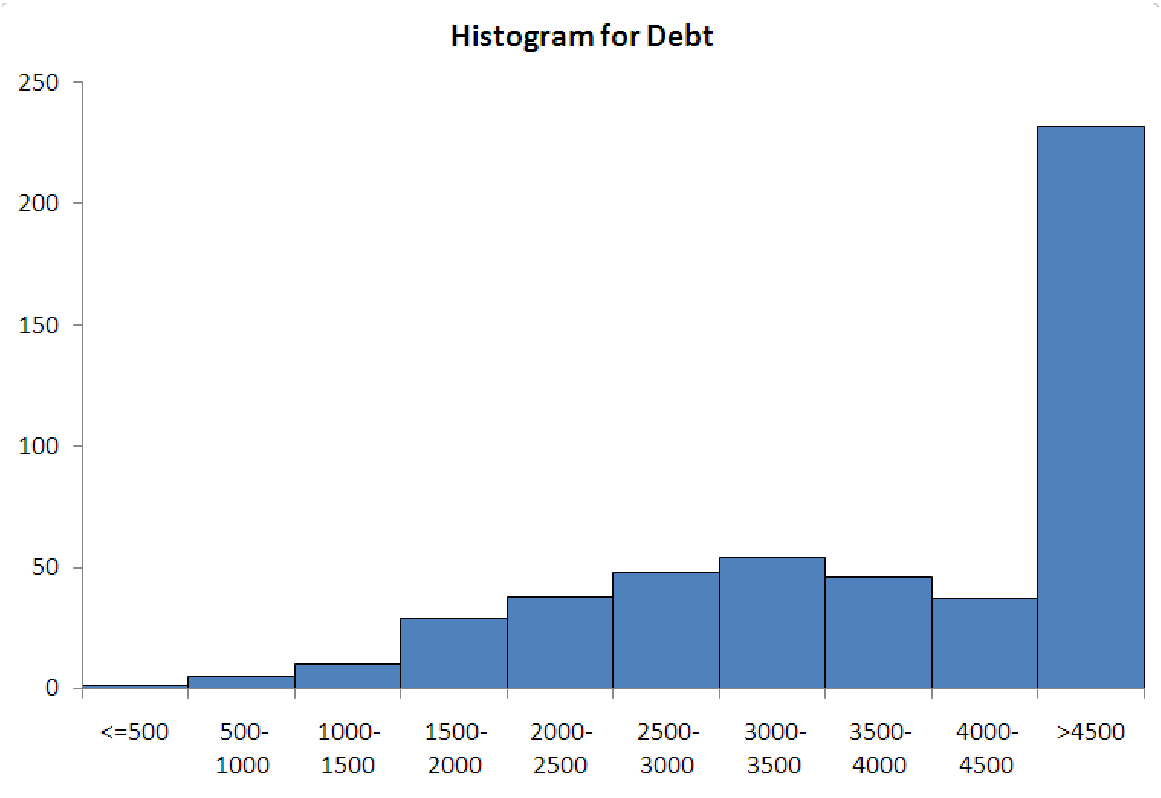
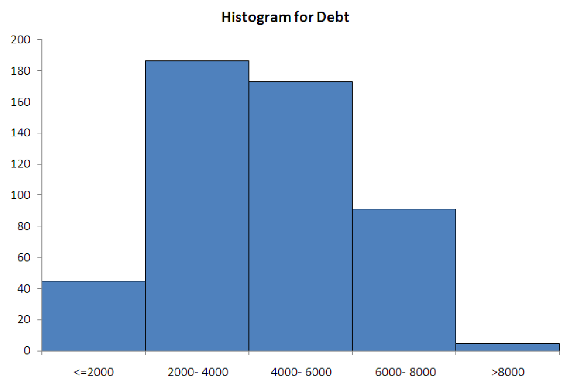
The five graphs in figure 5.5 illustrate the ways that histogram-makers often ”go wrong”. The data for each graph is the same, and it represents the amount of household debt accumulated by various households in a recent survey. Notice how each graph makes the data look very different, possibly leading to misunderstandings about the underlying data.
 |  |
| Case 1a: Too much data in first bin. | Case 1b: Too much data in last bin. |
 | 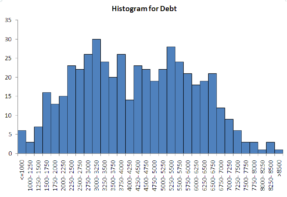 |
| Case 2: Too lumpy. | Case 3: Too spread out. |
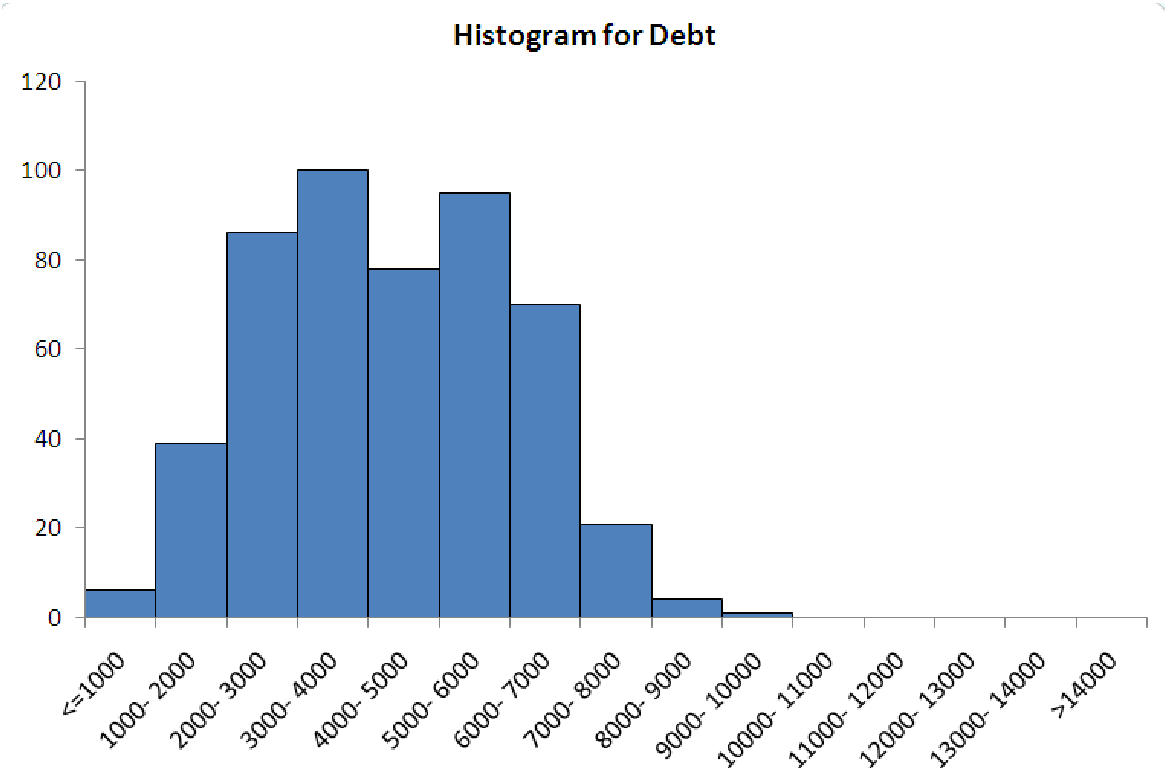 | |
| Case 4: Too much wasted space
| |
Case 1. Too much data in the end bins
This is a classic problem, typically caused by miscalculating where the two ends of the distribution
are. The reason it is such a problem is that the end bins are usually ”open-ended”. This means
that they do not cover a specific interval. Instead, they are usually labeled with ”¡= some number”
for the left end and ”¿ some number” for the right end. If too much data is in either of these bins,
then you cannot really describe the distribution, because you do not know how far the data
extends.
Case 2. Bins are too wide (lumpy)
This problem is usually caused by making the bins too wide. This means that each bin covers a
large range of observations and means that you can fit fewer bins into the range of the data. To see
how many bins of a particular size will fit into a range of data, take the range of the data
(maximum value minus the minimum value) and divide by the width of the bins. For example, if
the data goes from 0 to 100, and you make each bin 25 units wide, then you will have
all of the data in (100-0)/25 = 100/25 = 4 bins! This will not provide you with much
information.
Case 3. Too few observations in each bin (compared to total number of observations)
This problem is the opposite of case 2. This is caused by having so many bins that only one or two
observations fall into each range. If you have 100 observations that range from 0 to 100, then it
does not make sense to use 100 bins that are 1 unit wide. This isn’t any better than the original
data, since each bin will have, on average, only one observation. It’s usually best to stick to
eight to twelve bins for a histogram, unless there are many observations and the data
needs more bins in order to see the detail. Typically, this is only needed with bimodal
data.
Case 4. There are empty bins on the ends
This problem is also caused by miscalculating the locations of the ends of the data. While it is not
really a problem, this situation does lead to wasted space in your graph. In addition, the
empty bins could be used to mislead someone about the true distribution of the data.