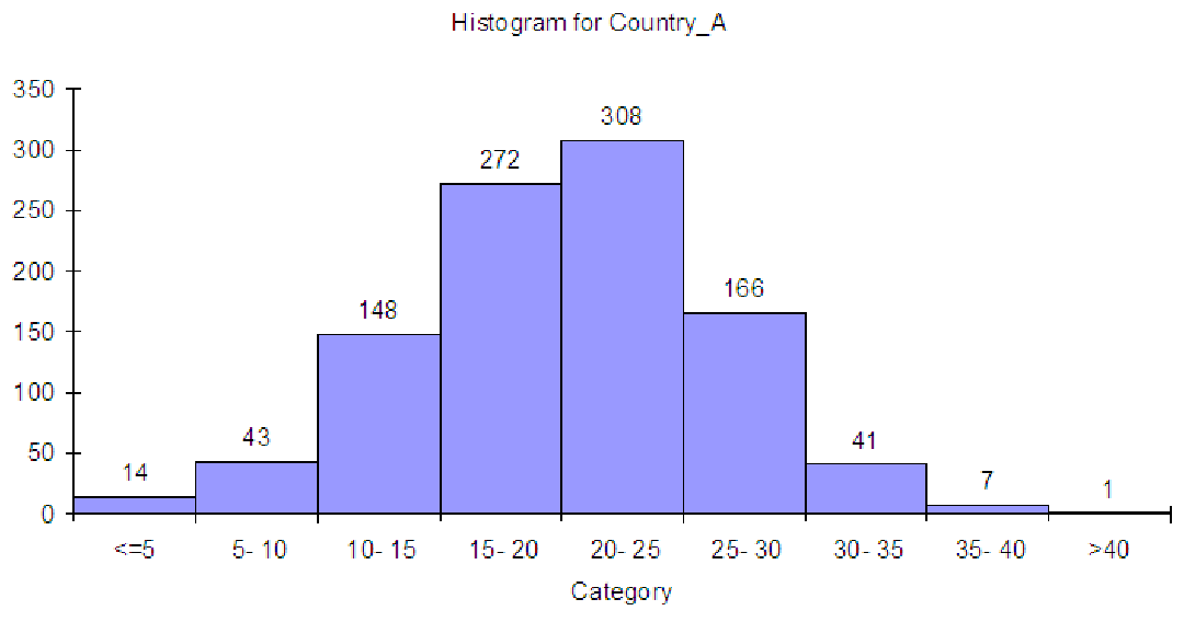
Figure 6.5: Histogram of incomes for 1,000 families in country A.
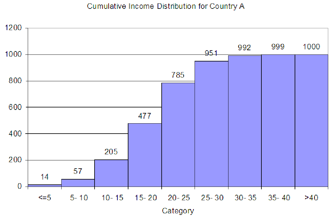
Example 6.5. From histograms to cumulative distributions
Consider the data on family incomes in Country A from C02 Incomes.xls [.rda]. These are
shown in a histogram below. There are 1,000 total observations in the data.
To convert this graph to a cumulative distribution, we simply start adding. In the first bin, labeled ”<= 5”, we have a total of 14 observations. In the second bin, we have 43 observations. In the cumulative distribution, the second bin will have 14 + 43 for a total of 57 observations, since it includes all the bins to the left. The third bin of the cumulative distribution will have 148 + 57 = 205 observations. The fourth bin ”15 - 20” will have 272 + 205 = 477. Continuing on, we get the totals shown in the graph below.
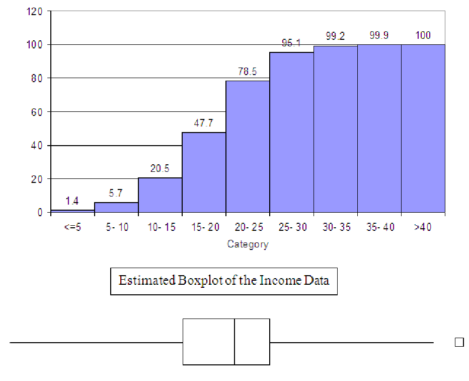
Example 6.6. Using the cumulative distribution to sketch a boxplot
Now, to generate a boxplot of the data above, we probably want the cumulative distribution
graphed in terms of percentages (of the total number of observations), rather than total amounts.
This graph is shown below. Once we have this, it is relatively easy to determine in which bin each
of the quartiles falls. Remember the first quartile is the same as the 25th percentile, so in the graph
below, we know that the first quartile is somewhere in the bin marked ”15 - 20”. Since 20.5% of the
data is to the left of this bin, we can probably guess that the first quartile will be close to the left
side of the ”15 - 20” bin. We can also find the median; 50% of the data is less than the
median, so it must be in the fifth bin, marked ”20 - 25”. It is probably close to the left
edge of this bin. Interestingly enough, the third quartile includes 75% of the data to its
left, so it is also in the fifth bin, ”20 - 25”. Q3 is probably close to the right side of
the bin. Based on these estimates, then, we can sketch a boxplot on the same scale
axis as the histogram. We know where the minimum and maximum are, so we can also
compute whether there are any outliers in the data. For this graph, the largest the IQR
could be is 10, since Q1, the median and Q3 are in the fourth and fifth bins. Thus,
anything further than 15 (three bins) from the end of either side of the box must be an
outlier. (The histogram itself shown only one observation in the last bin, so it is the only
outlier.)
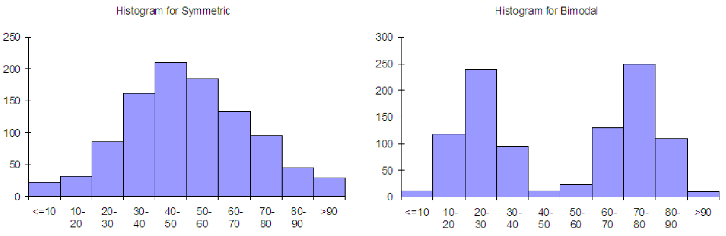
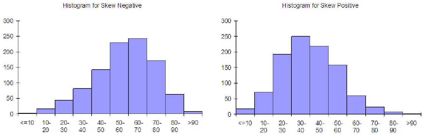
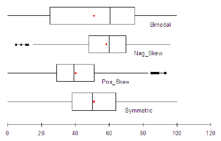
Example 6.7. From a boxplot to a histogram
There are several ways to sketch a histogram from a given boxplot. One way is to reverse the
process in the previous two examples. But there is a quicker way to sketch the histogram, based on
the shape of the boxplot. Consider the graphs below, which show four basic histograms and their
associated boxplots. All graphs are on the same 0 to 100 axis.
As you can see, the box of the boxplot falls in about the same place as the large bulk of the data. This means that you can start with a boxplot and sketch the bulk-part of the histogram where the box is if the box is fairly narrow (if it is a wide box, then the distribution is probably bimodal). Notice that the box is centered between the min and max for a symmetric distribution and for a bimodal distribution, except that a bimodal distribution has a larger spread, so the box is very long. In fact, for bimodal distributions, the box tries include both of the ”humps” in the distribution. Notice that for skewed distributions, the box is still where the bulk of the data is, but it is offset from the center. For positively skewed distributions, the bulk is shifted to the left, and the mean is greater than the median. For negatively skewed distributions, the bulk is shifted to the right, and the mean is less than the median.