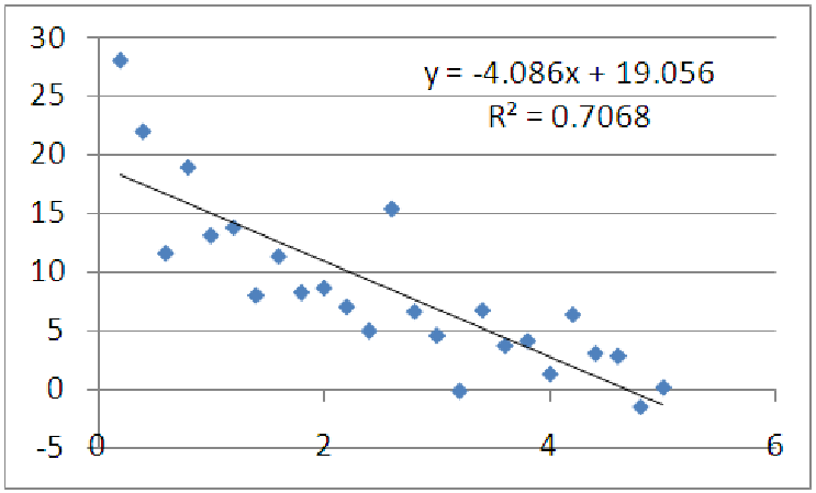
Figure 11.7: Does a linear function fit these data well?
Example 11.1. Using a graph of the data to see nonlinearity
Consider the data graphed below. What can we say about it? It appears that as x increases, the y
values decrease. It also looks like the data is bending upward. Mathematicians call this
behavior ”concave up”. Let’s see what happens when we apply a linear regression to these
data.
It looks like a good candidate for fitting with a straight line, and the R2 value is acceptable for some applications, but notice there are distinct patterns in the data, when compared to a best fit line. On the left, the data is mostly above the line, in the middle, the data is mostly below the line, and on the right, the data is mostly above the line. Patterns such as this indicate that changes in the Y data are not proportional to changes in the x data. To put this another way, the rate of change of y is not constant as a function of x, which means there is no single ”slope number” that is the same for every point on the graph. Instead, these changes are level-dependent: as we move our starting point to the right, the y change for a given x change gets smaller and smaller. In a straight line, this is not the case: regardless of starting point, the y change for a given x change are the same. If the data are best represented by a linear model, we would not see any patterns in the data points when compared to the model line; the points should be spread above and below the best-fit line randomly, regardless of where along the line we are. For the graph above, though, we do see a pattern, indicating that these data are not well suited to a linear model.
Notice that R2 by itself would not have told us the data is nonlinear, because the data is tightly clustered and has little concavity. Clearly, the more concave the data is, the worse R2 will be for a linear fit, since lines have no concavity and cannot capture information about concavity.
Example 11.2. Comparing logarithmic models and square root models
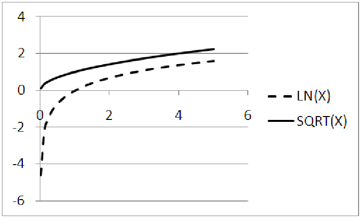
You may have noticed that two of the functions above, the square root and the logarithmic, look
very similar. Why do we need both of them? After all, the two graphs (see figure 11.8) have very
similar characteristics. For example, both start off very steep for small values of x and then flatten
out as x increases. Both graphs continue to increase forever. Neither graph exists for negative
values of x.
However, the graphs are actually quite different. For instance, consider the origin. The point (0, 0) is a point on the square root graph (since the square root of zero is zero,) but it is not a point on the logarithmic graph. In fact, if you try to compute the natural log of zero, you will get an error, no matter what tool you use for the calculation! The logarithmic function has what is called a ”vertical asymptote” at x = 0. This means that the graph gets very close to the vertical line x = 0, but never touches it. This is quite different from the square root graph which simply stops at the point (0, 0). Furthermore, the square root has a horizontal intercept of x = 0, while the logarithmic graph crosses the x-axis at (1, 0).
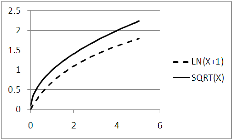
You might be tempted to think that we could simply ”move” the logarithmic graph over so that they both start at the same place, (0, 0). Figure 11.9 shows what happens if we pick up the graph of y = ln(x) and move it to the left one unit, so that both graphs pass through (0, 0). Notice that the square root graph rises sharply and then flattens, while the natural log graph rises more gradually. It also appears that the slope of the square root graph is larger and that it continues to grow larger, widening the gap between the two functions. In fact, the natural log grows so slowly that the natural log of 1,000 is only 6.9 and the natural log of 1,000,000 is 13.8! Thus, if the x-values of your data span a large range, over multiple orders of magnitude, a natural log may help scale these numbers down to a more reasonable size. This property of logs makes them useful for measuring the magnitude of an earthquake (the Richter scale) or the loudness of a sound (measured in decibels). Compare this growth to the square root function: The square root of 1,000 is about 31; the square root of 1,000,000 is 1000. This is a much larger increase than the natural log. In fact, of all the basic functions, the natural log is the slowest growing function; in a race to infinity, it will always lose.
Example 11.3. Comparing exponential models and square models
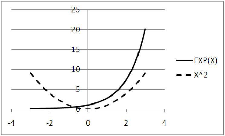
You may have also noticed that, for positive values of x, the graphs of the exponential function and
the square function are very similar. Both are increasing. Both are growing large at a faster and
faster rate, which shows in the graphs from the increasing steepness of each graph as
x grows larger. This property of getting larger at an increasing rate is referred to as
being ”concave up.” This makes the graphs bend upward, away from the x-axis so that
it looks like a cup that could hold water. Both graphs also start rather flat near the
origin.
Here is where the similarities end, though. The square function has a vertical and horizontal intercept at (0, 0). The exponential function, on the other hand, has a vertical intercept of y = 1, but no horizontal intercept at all. Much like the logarithmic function (see the previous example) the exponential function has an asymptote. In this case, though, it is a horizontal asymptote at y = 0, rather than a vertical intercept at x = 0. In addition, when we look at the graphs for negative values of x, we see that the exponential function is always increasing, while the square function is decreasing for x < 0. This means that the square function has a minimum, or lowest, point.
These properties are also easy to see numerically from working with the functions themselves. If I take a negative number and square it, I get a positive number. Thus, (-3)2 = +9, (-2)2 = +4, (-1)2 = 1, etc. Notice that as the negative values of x get closer to 0, the output of the square function is decreasing. For an exponential function, we notice negative exponents are really a shorthand way of writing ”flip the function upside down and raise it to a positive power.” Thus, to compute e-2, we compute 1∕e2 ≈ 1∕7.3891 ≈ 0.1353. This is where the asymptotic nature of the exponential function shows through; for large negative powers, we are really computing one divided by e raised to a large positive power. Since e to a large positive power is a large positive number, one over this number is very small and close to zero.
As it turns out, the exponential function is the fastest growing of all the basic functions. In a race to infinity, it will always win.