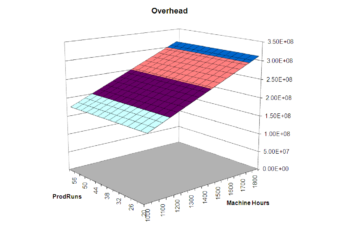
Figure 13.4: Linear two-variable model of overhead versus Production Runs and Machine
Hours.
Example 13.4. Looking at a multi-linear function
Recall the model from the previous section that represented our best, linear efforts to model the
overhead based on the machine hours and production runs:
Overhead = 3996.68 + 43.5364 ⋅ MachHrs + 883.6179 ⋅ ProdRuns
File C13 Production2.xls [.rda] shows a table of values for this function, calculated over a domain similar to that present in the data. Below is a 3D surface plot of these data, showing the linear structure.
Notice that this graph appears to be a flat plane, like a piece of paper tilted at an angle. Any linear function of two variables has such a graph.
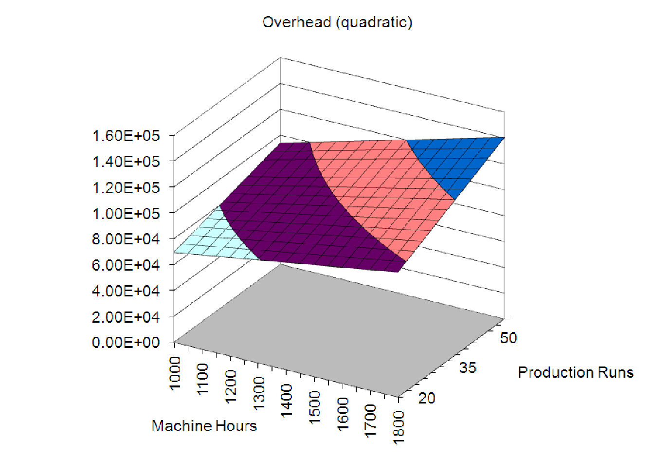
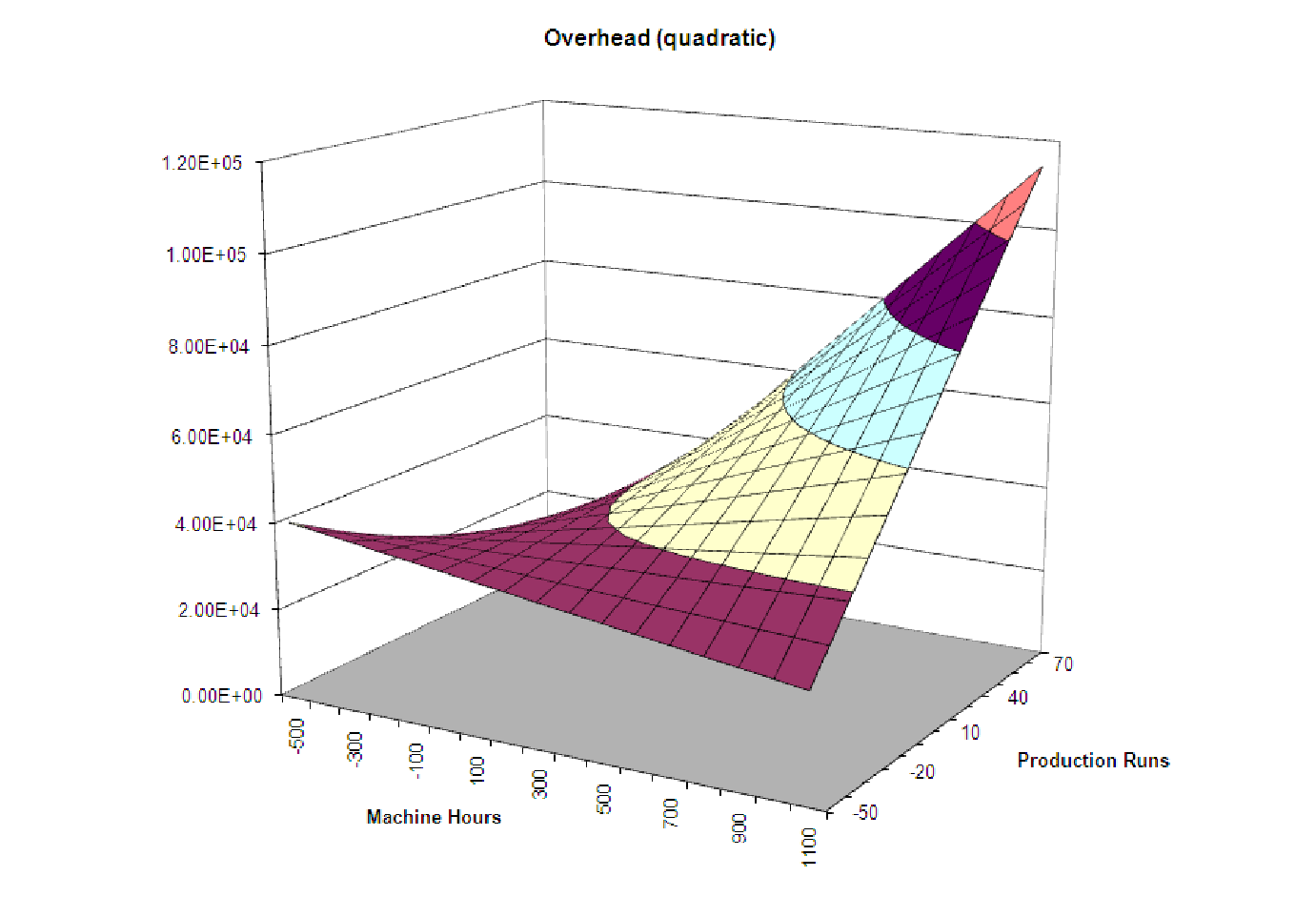
Example 13.5. Looking at a quadratic function of two variables
Here is one possible graph for a quadratic function of two variables. This is based on the quadratic
model of the overhead costs found in C13 Production2.xls [.rda] in the worksheet labeled
”Example 13B2”. It uses the model shown below.
Overhead = 35,778.20 + 0.6240 ⋅ MachHrs ⋅ ProdRuns + 21.2566 ⋅ MachHrs
Notice that the formula in cell C5 uses mixed cell references (see the ”How To Guide” for details) in order to calculate the overhead from a given number of machine hours (in column B) and a given number of production runs (row 5).
C5 = 35778.2 + 0.624*$B5*C$4 + 21.2566*$B5
The graph of this model is shown below.
Notice that this graph also appears, at first glance, to be linear - like a plane. However, the contour lines on the surface between the different colored regions are curved, indicating that this is truly a nonlinear model. The reason it doesn’t look quadratic is because of the particular set of values of MachHrs and ProdRuns we have used to graph the function. When we graph it over a larger region, we can clearly see the warped ”saddle” shape of the surface become apparent. Of course, we could never have negative values of machine hours or production runs in a given month, so the actual data will never show this. Thus, we see that even when the data may be best represented by a nonlinear model, it may not be clear from the graph.
Also note that in the notation given in the ”Definitions and Formulas” for the discriminant, we have B1 = B2 = 0 and C = 0.6240. This means that the discriminant, D, is -0.62402, which is less than zero, confirming that we should see a saddle in the graph.
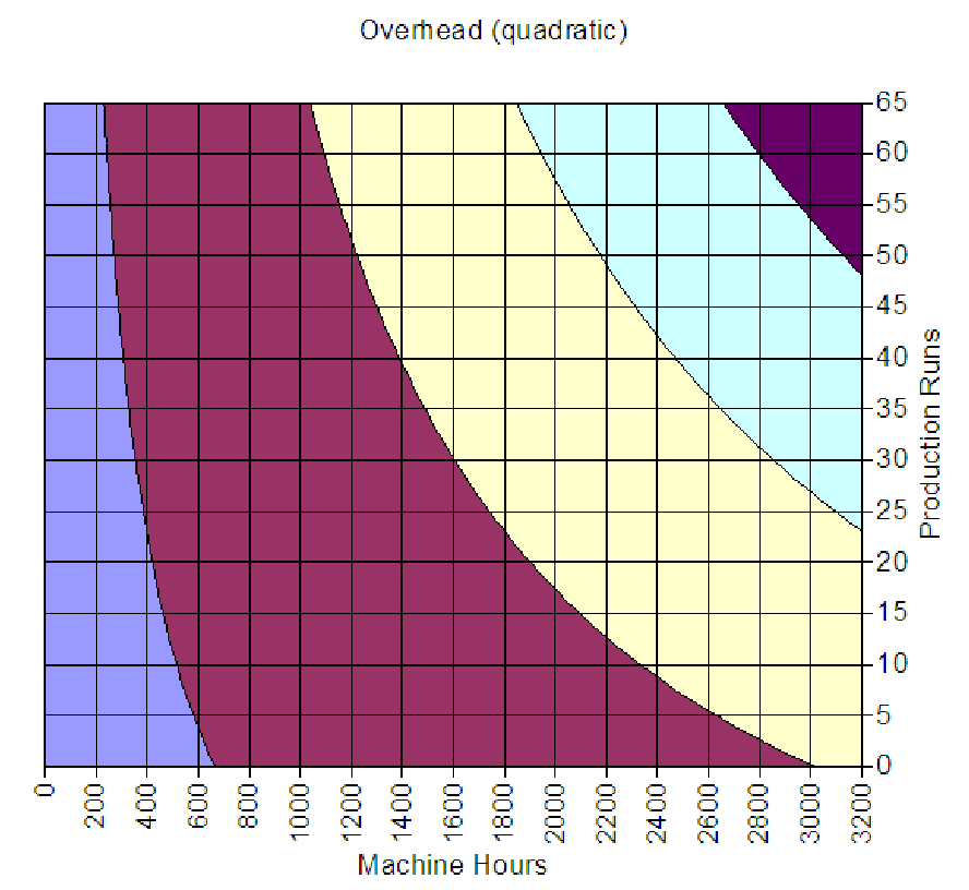
For the sake of completeness, we view the graph of overhead from above (graphed on the region with all independent variables positive). Such a graph is called a contour plot and shows curves (called contours) that separate regions based on their coordinate in the third dimension. Notice that all of the contours are curved, another indication that the underlying graph is nonlinear. In fact, it can be shown that these curves are hyperbolas, a type of object closely related to parabolas.
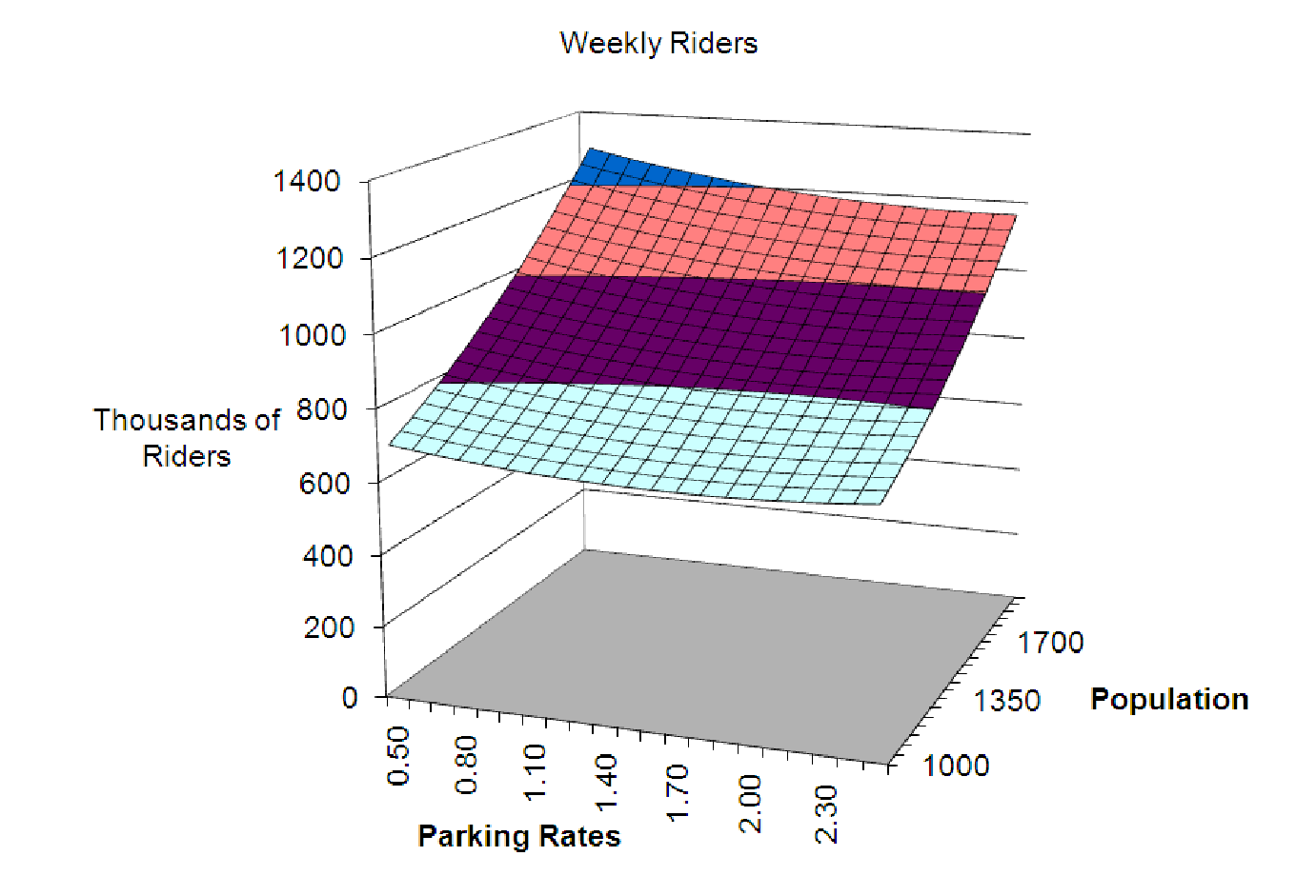
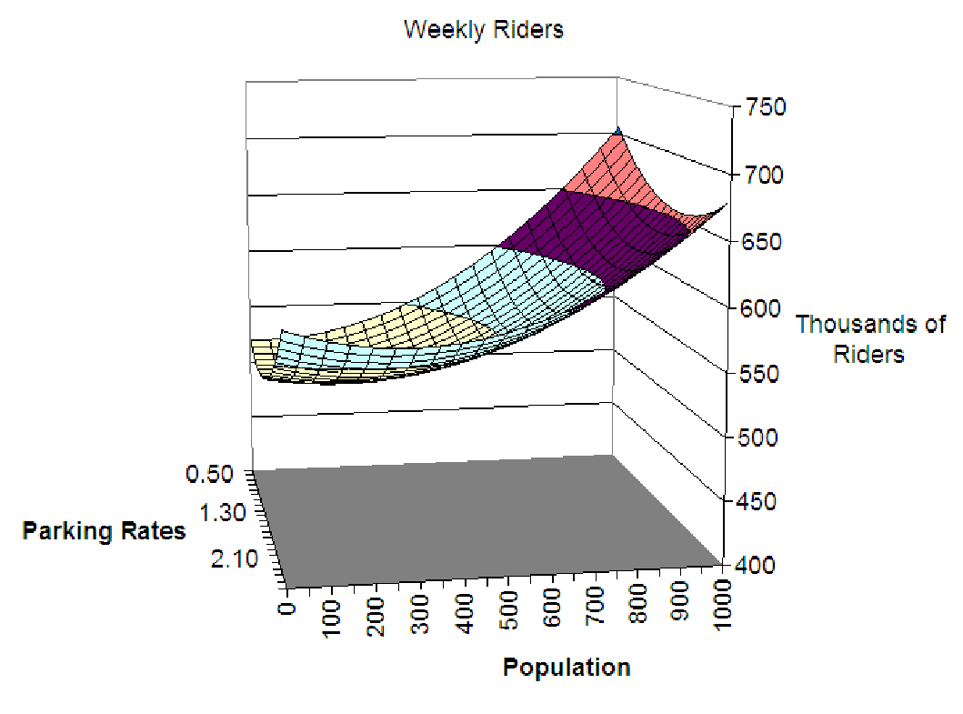
Example 13.6. Another quadratic surface
Let’s look at a graph of the surface representing the quadratic Weekly Riders model from example
3. This model, after reducing it to two variables, became

When graphed over the region with Parking Rates from $0.50 to $2.50 and Population between 1,000 thousand people and 2,000 thousand people, we appear to see a linear model. But a calculation of D gives D = 0.0264 which is positive. Since the coefficients of the squared terms are both positive, this seems to indicate that we should see a bowl-shaped surface. How are we to reconcile the calculation with the graph?
This is always part of the problem in graphing and interpreting nonlinear models, especially those of several variables: such functions tend to have large domains, and tend to look very different at different locations in the domain. To emphasize this, we look at the graph on a slightly expanded domain where the shape is more evident.
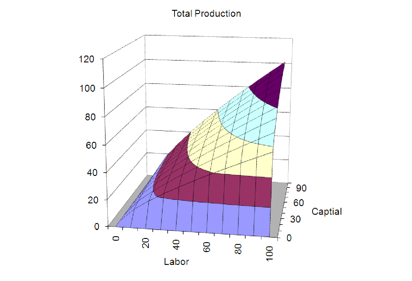
Example 13.7. Multiplicative models
As a final example, we will look at a graph of one of the other multivariable, nonlinear models we
have encountered, the multiplicative model. The model below is a Cobb-Douglas production
model. P represents the total production of the economy, L represents the units of labor
available and K represents the units of capital invested. We met such models in the last
chapter and applied parameter analysis to their interpretation. But what do they look
like?

As you can see from the graph below, when we plot the production for reasonable values of the labor and capital (both positive) the contours look like those of a saddle-shaped surface, but the graph does not look like a saddle. The graph shows that if either of the inputs is zero (capital or labor) the production is zero. It also shows that if you increase either input (or both) you continue to get more output.